JOTS v40n1 - Effect of pre-defined Color Rendering Intents (CRI) on the Hue attributes in a Color Managed Workflow (CMW)
Dr. Haji Naik Dharavath and Uttam Kokil
ABSTRACT
The purpose of this study is to determine the influence of applied International Color Consortium (ICC) predefined color rendering intents on the digital printing solid colors output (Cyan, Magenta, Yellow, and Black ([CMYK]) hue and gray output (Overlap of CMY: 50%, 40%, and 40% tints) hue variation among the four ICC standard color rendering intents in a color management workflow (CMW). The experiment analyzed the effect of four ICCspecified color rendering intents (absolute, perceptual, relative, and saturation intents) on the digital color output hue of gray and solid colors. The objective of this study allowed testing of an accepted color management practice to gain a better understanding of the presumptions associated with the application of rendering intents. The experiment examined the four ICC color rendering intents as independent groups (K = 4) using a one-way analysis of variance (ANOVA) with equal n’s method (at α = 0.05) to determine the significant colorimetric variation (COLVA) of hue between the (K = 4, n = 15, and N = 60) group means (averages) color deviations of these intents. With four rendering intents (groups, K = 4), a one-tailed, non-directional hypothesis was established. The conclusions of this study are based upon an analysis of ANOVA test data and associated findings. The data from the ANOVA reveal significant differences in the gray hue deviation of the reproduction among the multiple ICC color rendering intents (CRI). The colorimetric data suggests that selection of a rendering intent is an important activity in a CMW as it relates to obtaining accurate output colors for a desired purpose.
Keywords: Calibration, Color, Colorimetry, Gamut, Profiling, Proof, Color Rendering
INTRODUCTION
Modern printing technology has evolved from the craft oriented field toward a color management science demanding greater color reproduction control among the devices used in the print and imaging industry. Graphic or printing workflow is represented through schematic illustrations of activities that reflect the systematic organization of analog and digital devices used during the print and image production process. In a quest to empower students to better understand the attributes of various hue variables, this work examined standardized rendering defaults similar to those a student would encounter through software that manages color manipulation and drives output (or printing) devices, such as a laser color printer, an inkjet printer, or a digital color press. Hence, for a student to consistently deliver a quality print, managing and controlling color from the input device to a multicolor output device is a major concern for the graphics and imaging educator.
Color can be viewed as a science where the optical aspects of color can be quantitatively analyzed and measured. The human eye, however, perceives color more subjectively, which poses a challenge at times for the print and image reproduction industry. Advancements in science and engineering, however, have allowed print and image professionals to apply scientific research methods across prepress, pressroom, and quality control areas. Teaching these methods to students will heighten their recognition of the importance of proper workflow. Unfortunately, the use of color management systems has not yet solved all of the problems of color reproduction ( Fleming & Sharma, 2002 ), such as acceptance of linear colors, reproduction of neutral gray-balance, effect of rendering intents, level of ΔH or ΔE acceptance, and so forth. Hence, this has given rise to quantification of color problems ( Fleming & Sharma, 2002 ).
Color Management System (CMS)
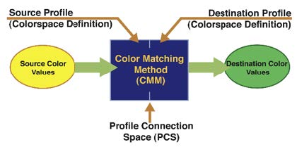
In a color-managed workflow, the device characterization is presented in terms of specially formatted files (known as profiles or device characterization). A CMS or a CMW uses a set of hardware tools and software applications to create accurate color among various input, display, and output devices. A CMS consists of device profiles (or characterization of devices), which control and document the working performance of the scanner, monitor, and printer. A device color transformation engine (color management module or CMM) interprets the color data among the scanner, display, and printer. The gamut compensation mechanism of the CMS addresses differences among the color capabilities of input, display, and output devices. The profile connection space (PCS) is a device-independent color space through which all color transformation occurs from one device-dependent color space to another (see Figure 1). The PCS is based on the spaces derived from CIE color space. Apple ColorSync supports two of these spaces: L* a* b* and XYZ. The color conversion from device-dependent color space to device-independent color space is achieved by the use of PCS. The device color characterization file (profile) passes in and out of the PCS to complete the transformation. The PCS of the CMS is the central hub of the CMS in which a particular color value is considered absolute and not subject to interpretation.
ICC Color Rendering Intents
According to ICC, color gamut mapping can be completed by one of the four ICC recognized colorimetric rendering intents: perceptual, absolute, relative, and saturation. The rendering intent determines how the colors are processed that are present in the source gamut but out of gamut in the destination (output). Rendering intents compiled by the ICC are “specifically defined for the purpose of cross-media reproduction using color management systems” (Morovic, Green, & MacDonald, 2002, p. 307). In essence, intents are large lookup tables (LUT) that prescribe the range of RGB or CMYK values to an output device. Because the 16.7 million color choices (224) in an eight-bit color scheme (RGB mode) or 4.3 billion color choices (232) in CMYK mode are unmanageable, intents are employed. Each rendering intent tends to be associated with select types of images and/or workflow stage situations, such as characteristics of the original, as well as reproduction media and its viewing conditions. These four intents– perceptual, saturation, absolute colorimetric, and relative colorimetric —are intended to produce uniquely different results and thereby have migrated toward selection based on general use guidelines ( Green, 2010 ).
Perceptual , also referred to as the photographic rending intent, is said to emphasize retention of relationship between colors, whereas colorimetric intents are thought to be high accurate in-gamut colors and saturation that deliver more colorful images ( Sharma, A., 2004 ). The aim of the perceptual rendering intent is generally to be pleasing, placing reproduction accuracy secondary while maintaining relationships between colors. This intent compresses or expands the gamut of the image to leverage attributes of the destination device.In this case, colorimetric accuracy may be compromised ( Morovic et al., 2002 ).
Saturation rendering is believed to be the vendor-specific intent, because this technique is mostly used with graphics and text with little regard for color per se. By saturating the pixels in the image, hue and lightness are discounted. Similar to perceptual rendering, this intent seeks to adjust for different devices, media, and viewing conditions. Many researchers suggest that it is suited most for images that incorporate charts and diagrams ( Sharma, G., 2003 ).
Absolute rendering intent strives to create exact colors. It is used to predict how an image will appear when printed on a specific substrate. In this situation, although colors that equate between the original and the print are unchanged, those out-of-gamut are clipped. With this intent, the reproduction will theoretically match the original if the paper matched. Proofing often uses this intent.
Relative colorimetric and absolute intents use clipping where a gamut boundary is forced. The relative colorimetric intent, however, relates to a white point on the substrate, best chromatically adapted to D50 conditions, and it adjusts all colors maintaining their relative position to white. Where matches between reproduction and original are sought, this intent often serves as the default.
It may be said that ICC rendering intents invite a heuristic application to a subjective solution. In contrast, psychophysiological evaluation techniques (also known as “the total experience”), have informed findings about colorimetric rending methods ( Milkovic, Knesaurek, Mrvac, & Bolanca, 2004 ) and gamut-mapping algorithms alike ( Braun, Bala, & Harrigton, 2005 ). These techniques seek to quantify perceptible change in color, though studies find that even though CIE describes ΔE of 1 as perceptible, the “average consumer would not detect any difference less than ΔE max value of 5” ( Mason, 2007, p. 2 ). The use of visual qualitative analysis has informed the selection of rendering intents and is commonly a metric incorporated into research about digital proofing ( Lin, Zhou, Lin, & Luo, 2009 ). Illustrative of the debate about generalizing intent usage, Green (2010, p. 28) suggested that, “it is not possible to standardize re-purposing transforms” as they hinge on subjectivity and viewer preferences. Furthermore, Green (2010) also stated that the perceptual and saturation intents are more about repurposing—producing a reproduction on a second medium where viewing conditions might be quite different. Yet, he suggested that the retargeting—intention of matching a reproduction on a different media is more suitable for colorimetric rendering intents.
Further compounding the challenge for color managers is device “personality” ( Sharma, A., 2005 ), which seeks to couple standardized transforming methods (ICC rendering intents) and gamut mapping to establish quality validation. Gamut mapping applies a set of rules to produce the best color match, and rendering intent works to maintain color accuracy while also remapping non-reproducible colors ( Berns, 2000 ). To systematically control for variance, color managers use industry intents that modify the input data by applying linear and nonlinear compression, various cutting techniques, and select algorithms in accordance with ICC standards ( Milkovic, Bolanca, Mrvac, & Zjakie, 2006 ). In short, these intents take visual data from one source, mathematically manipulate this data based on a predetermined industry criterion, and direct that repurposed data to a select output device. Efforts to control device variance are a technological juggernaut for managers, given the characteristic differences of RGB and CMYK, electronic manipulation, and physical manipulation, respectively.
Lightness, Chroma, Hue (L*C*H) and Gray
Each color has its own distinct appearance based on hue, chroma (saturation), and value or lightness ( X-Rite, 2007 ). By describing a color in terms of these three attributes, one can accurately identify a particular color and distinguish it from others. When asked to describe the color of an object, most people mention its hue first. Quite simply, hue is how people perceive an object’s color, such as red, orange, or green ( X-Rite, 2007 ). Chroma describes the vividness or dullness of a color: how close the color is to either gray or to the pure hue. For example, the red of the tomato is vivid, but the red of the radish is dull ( X-Rite, 2007 ). The luminous intensity of a color (i.e., its degree of lightness) is its value. Colors can be classified as light or dark when their values are compared. For example, 15 when a tomato and a radish are placed side by side, the red of the tomato appears to be much lighter. In contrast, the red of the radish seems to have a darker value ( X-Rite, 2007 ).
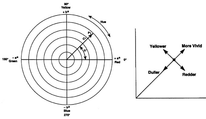
The L* c* h* color space uses the same coordinates as the L* a* b* color space, but it uses cylindrical coordinates instead of rectangular coordinates. In this color space, L* indicates lightness and is the same as the L* of the L* a* b* color space, C* is chroma, and h* is the hue angle. The value of chroma C* is 0 at the center and increases according to the distance from the center (See Figure 2). Hue angle h is defined as starting at the +a* axis and is expressed in degrees; 0° would be +a* (red), 90° would be +b* (yellow), 180° would be –a* (green), and 270° would be b* (blue). Metric chroma C* and the Metric hue angle h* are defined by the following formulas ( Morovic, et al. 2002 ):
$$C = \sqrt{(a^*)^2 + (b^*)^2}$$
$$h^*_{ab} = tan^{-1} \bigg( {b^* \over a^*} \bigg)$$
where: a*, b* are chromaticity coordinates in L* a* b* color space
Gray balance is the proper percentage of combinations of cyan, magenta, and yellow inks that produce neutral shades of gray. Hue shifts will occur when there is any imbalance of one of the components. The imbalance is due in large part to ink impurities. Gray balance is a significant factor in determining overall color gamut. Gray balance can be determined by careful evaluation of a full set of tint charts printed with process inks. Colorimetric method is used to determine if the hue of gray is desirable in order to make sure that the black ink scale is neutral.Hue difference (ΔH*) is calculated by the following formula ( Morovic et al., 2002 ).
Purpose of the Research
The experiment was conducted in a color managed workflow to determine the printing colors (solid CMYK) and gray color (overlap of C = 50%; M = 40%; and Y = 40%) hue variation among the four ICC standard color rendering intents. It focused on the application of various color rendering intents to print color images by using CMYK dry toners on a digital color printing device that utilized a color laser digital printing technique (color electrophotography). The objective was to study the influence of applied color rendering intents in the printing color and gray color hue in a CMW. The following one-tailed nondirectional hypothesis was established, because of the multiple rendering intents (groups, K = 4).
Ho: There is no difference (or relationship) in the printing CMYK ΔH and Gray ΔH (CMY overlap) of multiple color rendering intents, when the printed colorimetry is compared against the reference colorimetry.
Ha: There is difference (or relationship) in the printing CMYK ΔH and Gray ΔH (CMY overlap) of multiple color rendering intents, when the printed colorimetry is compared against the reference colorimetry.
Limitations of the Research
For this experiment, there were limitations to the technology used within the graphics program laboratory. Prior to printing and measuring the samples, the digital color output printing device and color measuring instruments (spectrophotometer and densitometer) were calibrated against the recommended reference. The print condition associated with this experiment was characterized by, but not restricted to, inherent limitations. For example: colored images (IT8.7/4, ISO300, and ISO12647-7) chosen for printing, desired rendering intent applied, type of digital printer for proofing/printing, type of paper for printing, type of toner, resolution, and screening technique, use of predefined color output profiles, and calibration data applied, and so on. Several variables affected the facsimile reproduction of color images in the CMW, and most of them were mutually dependent. The scope of the research was limited to the color laser (electrophotographic) digital printing system (printing proof/printing) and other raw materials and the multiple types of color measuring devices and color management and control applications (data collection, data analysis, profile creation, and profile inspection) used at the university graphic communications laboratory. Findings were not expected to be generalizable to other CMW environments. It is quite likely, however, that others could find the method used and the data of this article meaningful and useful. The research methodology, experimental design, and statistical analysis were selected to align with the purpose of the research, taking into account the aforementioned limitations.
RESEARCH METHOD
The digital color output device used in this experiment was a Xerox DC250 CMYK printer (or digital press). It uses a Creo Spire CX250 raster image process (RIP) server (front-end system). This study utilized an experimental research method. MOHAWK brand 80 lb. mattecoated digital color printing paper was used. It was intended to determine the color differences of ICC rendering intents in a color-managed digital printing workflow. ICC specified color rendering intents are: absolute colorimetric rendering (ACR) intent, relative colorimetric rendering (RCR) intent, saturation rendering (SR) intent, and perceptual rendering (PR) intent. Each rendering intent in the experiment was considered as a group, noted by letter “K” (K = 4). Fifteen samples for each group were printed, noted by letter “n” (n = 15). For all the four groups, a total of 60 samples were printed, noted by letter “N” (N = 60). Multiple types of ICC standard based color management applications (software) and instruments were used in the experiment. A detailed method of this experiment is summarized in the following paragraphs. The digital color-printing laboratory made use of CMW for accurate color reproduction.
Printer Calibration
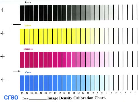
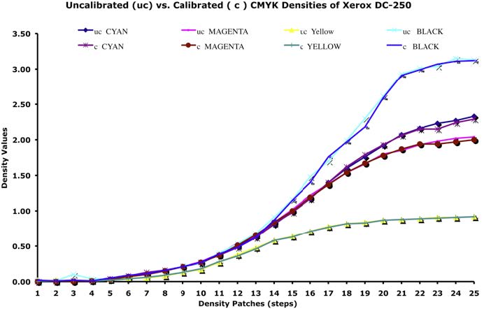
One of the important issues in getting acceptable print quality was the stable level of toner density (printer density). Fluctuation resulted from many controlled and uncontrolled variables, such as room humidity, temperature, printer settings, paper, age of toner, and inaccurate calibration or linearization of the printer. Therefore, calibrating the printer daily was very important. The calibration process for the printer used in the experiment was performed per the guidelines given by the device manufacturer. The CMYK calibration chart (with various tonal gradations) was printed without using any previous calibration data with 200 LPI (see Figure 3). An X-Rite DTP34 Scanning (Quick Cal) densitometer was used to scan the printed chart. The densitometer was calibrated against its reference chart prior to using it to calibrate the printer (or measure the chart). The calibration data (CMYK density ranges) was saved in the calibration lookup tables and a calibration curve was created (see Figure 4).
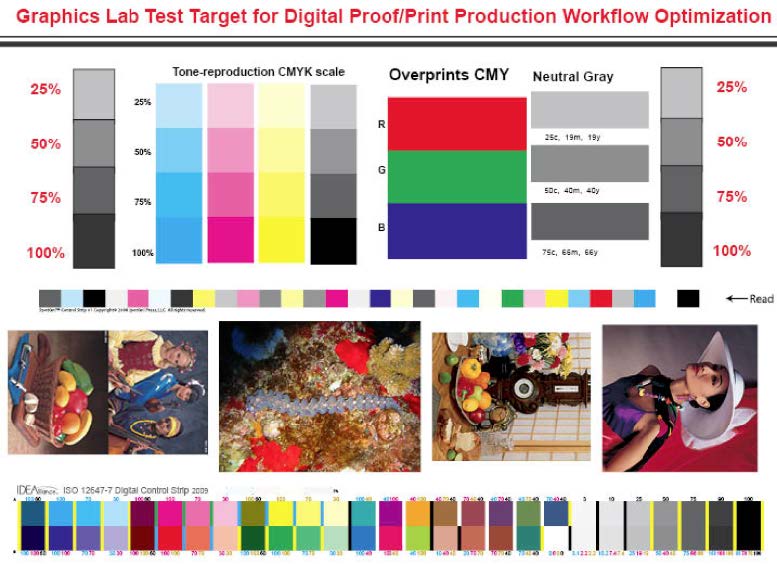
Test Image for Printing
A one-page custom test image of 8” x 10” size was created for proofing and printing use for the experiment (see Figure 5). The test target contained the following elements: an ISO 300 image for subjective evaluation of color, an ISO 12647-7 control strip, and a SpotOnPress! control strip. Colorimetric data was extracted from both the control strips. Color management settings were disabled in the Adobe InDesign CS-4 page layout application. All of the image elements were imported into the page layout program, and a PDF file was made without compressing the image data. The PDF file was sent to the Xerox DocuColor-250 Digital Press raster image processor (RIP). The press front-end system was powered by CREO Spire cx250 RIP, which runs on a Windows XP platform (Dell computer).
During the printing of the test image, in the color management option of the RIP, adjustments were made to print the test image, which included the following: a specific rendering intent, specific predefined (default) recommended profiles, lines per inch (LPI), and calibration data. In the CMYK emulation option of the RIP, adjustments were made to emulate the printing with a default profile and to print the test image with various ICC rendering intents. A recommended default destination profile was used to print the images. The device manufacturer recommended these two default profiles as predefined printing profiles. The final color printing/output was limited to these profiles, and other image color adjustment techniques were applied (rendering intents, LPI, calibration curve, etc.).
Printed Color Samples for the Analysis
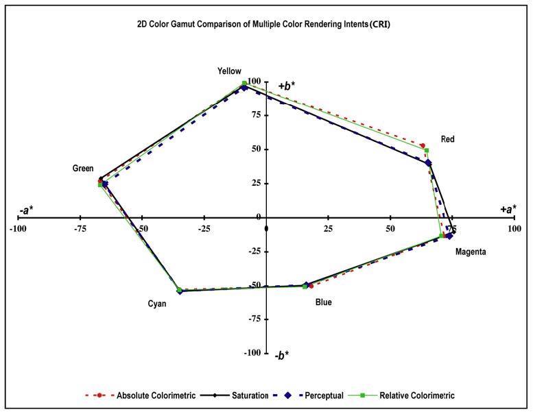
A total of 60 prints (copies) were printed, 15 for each color rendering intent of the same image on 80 lb. matte-coated paper (K = 4, n = 15, N = 60). Colorimetric data for various color quantification for each group was generated from the printed colors (SpotOn! and ISO 12647-7 control strips) by using Eye-One-Pro spectrophotometer with interface applications, such as the SpotOnPress! and Fujifilm Taskero ColorPath Verified. Colorimetric data from SpotOn! was used to create the 2D gamut (profile) of the specific rendering intent. All of the four-color rendering intent 2D gamuts were mapped for the visual comparison (see Figure 5).
Measured colorimetric data (via Fujifilm Taskero ColorPath Verified) from an ISO 12647-7 control strip was used to determine the mean of CMYK ΔH and gray ΔH (CMY overlap) between the printed colors and its reference data (IT8.7/4). Data derived from ISO 12647-7 control strip (sample) is the difference between the characterization data set (full IT8.7/4 target) and the sample. A total of 60 measurements were made, 15 for each color rendering intent (K = 4, n = 15, N = 60). The IDEAlliance ISO12647-7 control strip contained only a small subsample of IT8.7/4 target. It contained very little patches to prove an accurate match to a specific industry standard. However, it contained enough patches to monitor the accuracy of a color reproduction system against a reference target, such as the IT8.7/4. Table 1 presents the variables, materials, conditions, and equipment associated with the scanner, monitor, and printer of this experiment (see Table 1).
| Variable | Material/Condition/Equipment |
|---|---|
| Test images | A custom Test Target |
| Control strips | ISO 12647-7, and SpotOn!Press |
| Profiling Software | X-Rite ProfileMaker 5.0.10 |
| Profile Inspection Software | Chromix ColorThink-Pro 3.0 & Apple ColorSync |
| Image Editing Software | Adobe PhotoShop CS-4 |
| Page Layout Software | Adobe InDesign CS-4 |
| Source Profile (RGB) | Adobe 1998.icc |
| Emulation Profile (CMYK) | SpireOptimized.icc |
| Destination Profile (CMYK) | SpireDC250.icc |
| Color Management Module (CMM) | Adobe (ACE) CMM |
| Rendering Intents | ACR, RCR, PR, and SR |
| Computer & Monitor | Apple Macintosh 10.5.8/LCD |
| Raster Image Processor (RIP) | Creo Spire x250 |
| Printer | Xerox DocuColor-250 Color Laser |
| Uncalibrated CMYK SID | C = 1.71; M = 1.68; Y = 1.10; and K = 2.09 |
| Calibrated CMYK SID | C = 1.19; M = 1.23; Y = 0.94; and K = 1.96 |
| Screen Ruling | 200 LPI |
| Print Resolution | 2400 x 2400 DPI |
| Toner | Xerox Color Laser |
| Paper (sheetfed) | MOHAWK 80 lbs. matte-coated |
| Type of Illumination/Viewing Condition | D50 |
| Color Measurement Device(s) | X-Rite Eye-One-PRO Spectrophotometer with Status T, 2° angle, and X-Rite DTP34 scanning Densitomter |
| Data Collection/Analysis Software | FUJIFILM ColorPath Verified, SpotOn! Press, and MS-Excel |
STATISTICAL METHOD APPLIED FOR THE EXPERIMENT DATA ANALYSIS
The Statistical Package for Social Sciences (SPSS) was used to analyze the collected data to determine the colorimetric variation (COLVA). Since the K = 4, a one-way analysis of variance (ANOVA) with equal n’s method (at α = 0.05) was used to determine the significant differences that exist among the ( K = 4, n = 15, and N = 60) group means color deviations of the various color rendering intents ( Glass & Hopkins, 1996 ). The F-test is calculated by using the following equation ( Glass & Hopkins, 1996 ).
When statistically significant effects were detected among the four groups, the Tukey method—post hoc ANOVA analysis was used to determine which group ( K ) means were significantly different. The Tukey method, also known as the honest significant difference (HSD) test between two sample means, can be determined by using the following equation ( Glass & Hopkins, 1996 ).
The F distribution and a probability value p , which is derived from the F , were used to determine if significant differences exist in the output color attributes of multiple color rendering intents. F is a ratio of two independent estimates of the variance of the sample, namely between the groups and within the groups ( K = 4, N = 60). A low p value (or higher F value) is an indication that one should reject the stated null hypothesis (Ho) in favor of stated alternative hypothesis (Ha). This indication implies that one of the rendering intent means is significantly different. It suggests that there is a strong support that at least one pair of the rendering intent means is not equal. The higher the p value (or lower F value) indicates that the means of various color attributes of the color rendering intents are not statistically different. The value of q is the difference between the larger and smaller means of the two samples. Differences among the means at p ≤ 0.05 are considered to be statistically significant among all the groups ( K = 4) or color rendering intents. The main effect that the color rendering intents had on the digital color output in a CMW was determined by using the above-stated methods ( F and q ). The HSD multiple comparison test (with α = 0.05) in the experiment enabled the researchers to identify the significant difference from one group to another. In other words, which color rendering intent differs significantly from one another?
DATA ANALYSIS AND RESEARCH FINDINGS
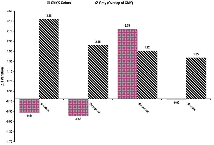
The ANOVA method was used to analyze the collected data. Color hue differences (ΔH) and gray hue differences were also derived to examine the noticeable color hue differences that exist among the various rendering intents. As stated in the previous section, the digital color prints (or proofs) printed with various rendering intents were analyzed by using ColorPath Verified against the IT8.7/4 reference data to determine the colorimetric deviations for Printing Colors Delta H (ΔH) and Gray ΔH (CMY overlap). Average deviations of these attributes were mapped (bar chart) for visual comparison (See Figure 7). Colorimetric data from SpotOn! was used to create the 2D gamut (profile) of the specific rendering intent. All the four-color rendering intent 2D gamuts were mapped for the visual comparison (see Figure 6). Subjective judgment on color difference was not used in this study. The subjective judgment of color difference could differ from person to person. For example, people see colors in an image not by isolating one or two colors at a time ( Goodhard & Wilhelm, 2003 ), but by mentally processing contextual relationships between colors where the changes in lightness (value), hue, and chroma (saturation) contribute independently to the visual detection of spatial patterns in the image ( Goodhard & Wilhelm, 2003 ). Instruments, such as colorimeters and spectrophotometers, could eliminate the subjective errors of color evaluation perceived by human beings.
Printing Colors (CMYK) Hue Deviation (ΔH): Reference vs. Printed Colorimetry
The average primaries ΔH were different from one rendering intent to the other. As such, the ANOVA test was conducted to determine if there was any significant difference, p ≤ 0.05 among the primaries ΔH of the rendering intents. The test showed that there was no statistical significant difference among the primaries ΔH, F (3, 56) = 1.21, p = 0.31 ; hence, the established hypothesis was accepted. This means, the applied color rendering intent did not significantly influence the primary colors ΔH (see Table 2) between the reference vs. printed colorimetric measurements. Post hoc analysis using Tukey HSD criterion for significance among the multiple color rendering intents primaries hue means was not required.
| Source of Variation | Sum of Square | df | Mean Square | F | Sig. |
|---|---|---|---|---|---|
| No Significant Difference [(α = 0.05 < 0.31) (F = 1.21 < 2.77)] | |||||
| Between Group | 118.26 | 3 | 39.42 | 1.21 | 0.31 |
| Within Groups | 1824.90 56 | 32.59 | |||
| Total | 1943.16 59 | ||||
Gray Color (Overlap of CMY) Hue Deviation (ΔH): Reference vs. Printed Colorimetry
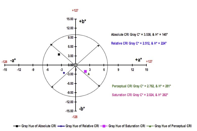
An ANOVA test revealed that there was a significant difference among the gray ΔH produced by each (multiple) color rendering intent, F (3, 56) = 5.09, p = 0.000 . Data indicated that each of the rendering intents altered the printed gray colors differently. As such, the effect was significant at the p < 0.05 for all four rendering intents (see Table 3). Post hoc analysis using the Tukey HSD criterion for significance among the multiple color rendering intents means indicated that when comparing absolute rendering intent (1) with other rendering intents (3 and 4), there was a significant statistical difference in the gray ΔH produced by various color rendering intents (see Table 4) at the p ≤ 0.05. The Tukey HSD test also indicated that the mean score of gray ΔH rendering intent 1 ( M = 3.18, and SD = 1.40) was significantly different from the rendering intents 3 ( M = 1.92, SD = 1.02), and 4 (1.64, SD = 1.02). The absolute rendering intent resulted in producing the highest gray ΔH, whereas relative rendering intent produced the lowest. No significant difference was found among gray ΔH mean scores of rendering intents 1 and 2 (absolute and perceptual) and 2, 3, 4 (perceptual, saturation, and relative).
| Source of Variation | Sum of Square | df | Mean Square | F | Sig. |
|---|---|---|---|---|---|
| *Significant Difference [(α = 0.05 > 0.001) (F = 5.09 > 2.77)] | |||||
| Between Group | 20.18 | 3 | 6.73 | 5.09 | 0.000* |
| Within Groups | 74.09 | 56 | 1.32 | ||
| Total | 94.28 | 59 | |||
| Comparison | Mean Difference | SD Difference | Sig. |
|---|---|---|---|
| * p ≤ 0.05 and ** p ≤ 0.001 (1 = Absolute, 2 = Perceptual, 3 = Saturation, and 4 = Relative) | |||
| 1 vs. 2 | 1.027 | 0.314 | 0.081 |
| 1 vs. 3 | 1.249 | 0.393 | 0.022* |
| 1 vs. 4 | 1.525 | 0.393 | 0.003* |
| 2 vs. 3 | 0.222 | 0.079 | 0.952 |
| 2 vs. 4 | 0.498 | 0.079 | 0.640 |
| 3 vs. 4 | 0.276 | 0.000 | 0.913 |
CONCLUSIONS
This research demonstrates the use of ANOVA to determine the influence of applied ICC color rendering intents in the primary colors and gray color hue variation among the four ICC standard color rendering intents in a color management workflow (CMW) on the digital color output. The findings of this study represent specific printing or testing conditions. The images, printer, instrument, software, and paper that were utilized are important factors to consider when evaluating the results. The findings of the study cannot be generalized to other CMW. However, other graphic arts educators, industry professionals, and researchers may find this study meaningful and useful. For example, educators can implement similar models, the presented model, or this method to teach a color management module. The colorimetric data of this experiment led to the conclusion that the selection of a rendering intent of a choice is an important step in a CMW in order to output accurate colors of choice for a desired use/purpose.
The conclusions of this study are based upon an analysis of the ANOVA test data and major findings (data and experience of the experiment). The data from the ANOVA test revealed that there were significant differences in the color reproduction among the multiple ICC color rendering intents (CRI). No significant differences were found in the CMYK color hue deviation (ΔH) of solid printing colors of these four-color rendering intents. In other words, the chosen rendering intent did not influence the outcome of printing color hue variation. There were significant differences found in gray color hue variation. The ΔH was statistically higher for absolute colorimetric rendering when compared with other CRI. Also, statistically, it was found that there was no difference among the remaining color rendering intents gray hue variation.
Furthermore, the experience of the experiments (visual comparison) and analyzed data proved that there were no color differences among the printed samples (photographs, commercial, and digital printing) of rendering intents, such as the absolute, relative, and perceptual. One could achieve the same color output regardless of which rendering intent was used among the three (absolute, perceptual, and relative colorimetric rendering intents). However, one should be cautioned to use the saturation intent because this intent produced the highest color deviation when compared with other intents. Higher color deviations (ΔE or ΔH) mean that the printed colors could be out of established deviation tolerances. Numerous reports reveal that the saturation intent was the least used in the industry, because it merely tries to produce good colors without any concern for the color accuracy.
Dr. Haji Naik Dharavath is an Associate Professor in the Department of Computer Electronics and Graphics Technology at the Central Connecticut State University, New Britain, CT.
Mr. Uttam Kokil is an Assistant Professor in Communication Design at Kennesaw State University, Kennesaw, GA.
References
Berns, R. (2000). Principles of color technology. New York: John Wiley and Sons.
Braun, K., Bala, R., & Harrington, S. (2005). Gamut mapping techniques for business graphics. [Online]. Retrieved from http://www.xerox.com/ . [2013, March 5]. Rochester, NY.
Fleming, P. D., & Sharma, A. (2002, August). Color management with ICC profiles: Can’t live without it. So learn to live with it. Gravure Magazine , p. 56.
Glass, G. V., & Hopkins, K. D. (1996). Statistical methods in education & psychology. Boston, MA: Allyn & Bacon.
Goodhard, M. M., & Wilhelm, H. (2003). A new test method based on CIELAB colorimetry for Evaluating the permanence of pictorial images. Retrieved from http://www.wilhelm-research.com/ . Grinnell, IA.
Green, P. (2010). Color management: Understanding and using ICC Profiles. NY: John Wiley & Sons.
International Color Consortium (ICC). (2009). About ICC. [Online]. Retrieved from http://www.color.org/ . Reston, VA.
Lin, M., Zhou, S., Lin, M., & Luo, Y. (2009). Influence of rendering intents on the gamut volume and the visual evaluations in digital proofing. Proceedings of International Conference on Computer Technology and Development, 13-15 Nov (pp. 587-589), Kota Kinabalu, Malaysia.
Mason, P. (2007). Image permanence: Comparing the technologies. Retrieved from http://www.tpr.com/PDFFiles/NIP23_IP_Comparing_the_Technologies.pdf . [2012, May 28]. Springfield, VA.
Milkovic, M., Knesaurek, N., Mrvac, N., & Bolanca, S. (2004). Gamut characteristics of chromatic and identical desaturated achromatic reproduction. In Proceedings AIC 2004 Color and Paints, Interim Meeting of the International Color Association (pp. 159-162). Zagreb, Croatia. Retrieved from http://www.fadu.uba.ar/sitios/sicyt/color/aic2004/159-162.pdf . [2013, May 10].
Milkovic, M., Bolanca, S, N., Mrvac, N., & Zjakie, I. (2006). The influence of standard rendering methods on the manifested intensity of the chromatic induction effect. TEHNIČKI VJESNIK ( Technical Gazette ), 13(1,2), 5-13
Morovic, J., Green, P., & MacDonald, L. (2002). Color engineering (pp. 297-314). NY:John Wiley & Sons.
Sharma, A. (2004). Understanding color management. Florence, KY: Thomson Delmar Learning.
Sharma, A. (March/April, 2005). Understanding color management concepts. IPA Bulletin. Retrieved from http://idealliance.org/files/Abhay-color-mgmt.pdf [2013, May 10].
Sharma, G. (2003). Digital color imaging handbook. Boca Raton, FL: CRC Press.
X-Rite, Incorporated. (2007). A guide to understanding color communication [Brochure]. Retrieved from http://www.xrite.com/documents/literature/en/L10001_Understand_Color_en.pdf