JOTS v35n2 - Green Printing: Colorimetric and Densitometric Analysis of Solvent-based and Vegetable Oil-based Inks of Multicolor Offset Printing
Green Printing: Colorimetric and Densitometric Analysis of Solvent-based and Vegetable Oil-based Inks of Multicolor Offset Printing
H. Naik Dharavath and Dr. Kim Hahn
Abstract
The purpose of this study was to determine the differences in the measurable print attributes (Print Contrast and Dot Gain) and color gamut of solvent-based (SB) inks vs. vegetable oil-based (VO) inks of multicolor offset printing. The literature review revealed a lack of published research on this subject. VO inks tend to perform (color reproduction) better than petroleum inks; in recent years many printers have come to prefer using VO inks. This research adopted an experimental research method. The experiment was conducted in a computer to plate (CTP) based workflow. During the printing, once the density values met the standard (GRACoL) ink density values, the press was run continuously without operator interference and 1,000 sheets were printed, from which 278 were randomly selected for colorimetric and densitometric analysis. The color gamuts of both inks were derived by using colorimetric data. The comparison of SB inks to VO inks led to the conclusion that the latter provides a greater color gamut. VO inks offer greater color perception in printed images. The densitometric findings make it difficult to draw conclusions about print contrast, as each of the inks had statistically significant higher levels of print contrast for two of the four ink colors. Further study is needed to control the variables.
Keywords: Colorimetry, Densitometry, Vegetable Oil-based inks, Solvent-Based inks, Offset Printing, Dot Gain, and Print Contrast
Introduction
In multicolor offset printing, a paste ink of a given color – yellow, magenta, cyan, and black (CMYK) is transferred from the ink fountain to the series of inking rollers and from there to the image areas of the plate (image carrier). The inked image area of the plate is then transferred to the blanket, and from the blanket it is transferred to the paper. A continuous tone color, or black and white photograph, is composed of a full spectrum of shades and color, from near white to dense black. The method by which the continuous tone of a photograph is transformed to a printable image is called halftoning , in which varying percentages of the press sheet are covered with halftone dots to represent the varying tones in the image. In the conventional halftoning process these dots are equally spaced. However, the size or diameter of the dots will vary according to the amounts of light reflected from the tones in the original photograph. The ink printed by each dot, of course, has the same density. At normal viewing distance, the dots of a printed image combine to create an optical illusion of a single-tone image.
Lithographic (offset) printing is a planographic process, also known as offset lithographic printing . It uses a flat aluminum plate (image carrier) on which image and non-image areas are photochemically or electronically generated. The principle of lithographic printing (lithographic offset process) is that water (or dampening solution) and inks (or oil) do not mix. The image area of the plate is receptive to ink; the non-image area of the plate is receptive to water ( Hsieh, 1997 ). The dampening solution is a mixture of chemical concentrate in a water-based solution. The single color offset press consists of three cylinders: plate, blanket, and impression. The plate, which holds image areas in a readable direction, is mounted on the plate cylinder, its surface is dampened, and then the surface of the plate is contacted by a series of inked rollers. The inked areas (image areas) transfer first onto the surface of the blanket cylinder where they become reversed (or mirrored) and then onto the paper where they become legible. The paper passes between the impression cylinder and blanket cylinder. In order to print a quality halftone image according to the established production standards, the printer (or press operator) must carefully manage several variables and attributes that are associated with the printing process. The print attributes are individual characteristics within the printing process that can be monitored during the production process so as to maintain the color consistency. The commonly monitored attributes are solid ink density, dot gain and print contrast. For this study, only the attributes of dot gain, print contrast, and color gamuts of both inks were used to examine the differences between these types of printing inks. Most of the image details were evaluated with the use of these screened tints only.
Purpose of the Research
The purpose of this study is to identify the differences in measurable print attributes (or characteristics) and color gamuts of SB and VO inks that are used in multicolor (CMYK) offset printing. The following questions were investigated.
- Is there a difference in the print contrast values (CMYK) of SB and VO inks?
- Is there a difference in the dot gain values (CMYK) of the SB and VO inks?
- Is there a difference in the color gamuts of the SB and VO inks?
Limitations of the Study
The print and color characteristics associated with the SB and VO inks are characterized by, but not restricted to, type of printing process, type of paper, and type of ink. Several variables affect the facsimile reproduction of SB and VO ink printed images and most of these variables are mutually dependent. The research was limited to the offset (lithography) printing systems and materials used at the University of Wisconsin-Stout’s graphic communications laboratory, and the findings are not expected to be generalizable to other printing environments. For the purpose of densitometry, only the attributes of dot gain and print contrast were used to compare the two inks, because these were the two attributes that measured patches made up of dots or screened tint percentages. In addition, the color gamuts of SB and VO inks were also compared.
Review of Literature
Green printing is defined as a movement in the printing industry to use natural resources to develop sustainable solutions for the future of printing and print advertising ( Argent, 2009 ). Choosing low-volatile organic compound (VOC) inks, using recycled or tree-farmed paper, working with local suppliers, and reducing the use of chemical products in the plate-making and printing areas are all part of this effort. In this article, we discuss using soy oil based ink or vegetable oil based ink for offset printing as one of the elements of green printing.
Print attributes are the individual characteristics within the printing process that can be measured and monitored during production so as to maintain a consistent quality. The most commonly monitored print attributes, and the ones of most interest to the researchers, are solid ink density, ink trapping, hue error, dot gain, print contrast, grayness, and gray balance ( Lustig, 2001 ).
Solvent-based Inks vs.Vegetable Oil-based CMYK Inks
There are many environmental and technical design advantages to the use of vegetable-based oils. Vegetable oil in printing inks is a renewable resource and conserves finite petroleum supplies. Soybean oil does not evaporate the way petroleum does, and soybean oil does not release harmful VOCs into the air that contribute to smog. Petroleum-based inks contain relatively high levels of VOCs, which are regulated by the updated Clean Air Act, as are the alcohol in fountain solutions and the solvents used to wash presses between jobs. VO inks will reduce VOC emissions because they contain less than half the VOCs, require less alcohol, work more easily with alcohol substitutes, and can be washed up without solvents. These inks reduce emissions from >30% VOC to as low as 2 - 4% VOCs ( Eco- and Mild Solvent, 2009 ). The printing press can be cleaned with a water-based cleaner, replacing a high-solvent cleaner and further reducing VOC emissions. The printed product is easier to de-ink in the recycling process and results in a less hazardous sludge ( Evans, 1997 ).
VO inks tend to perform better than petroleum inks, and many printers have come to prefer them. Vegetable oils tend to be more translucent than the naturally murky petroleum oils (Comparing Inks, 2009). This makes pigment, especially reds and yellows appear brighter, deeper, and richer. Furthermore, a more vibrant color enables a given amount of VO ink to produce more impressions than the same amount of petroleum-based ink, which can result in a 5-50% increase in transfer efficiency. VO inks are less likely than petroleum-based inks to build up on the printing plate, so facilities remain cleaner. This is the case because vegetable oil’s boiling point is significantly higher than that of petroleum oil; it is less likely to become volatile at high temperatures. In addition, VO inks can reduce ink and paper waste because the balance between ink and water is easier to achieve. These inks are well suited to uncoated and recycled stocks because they do not spread as much. In addition, they are not more costly than petroleum-based inks. Another benefit of VO inks is their “low rub-off ” quality in which the ink is less likely to stain readers’ fingers or clothing.
However, the disadvantages of VO inks include their slower drying time, particularly on uncoated paper because they penetrate paper more slowly and are set primarily by oxidation ( Alternatives to Petroleum, 1997 ). Most VO inks contain some petroleum oil to speed up drying or setting time and the amount of vegetable oil replacing the petroleum oil can vary by manufacturer and by press type and ink color. Pure formulation VO inks cannot be used in heat-set ink processes. To achieve appropriate drying times for these processes, vegetable oil may replace a portion of the petroleum oil. If no petroleum oil were used, print shops would increase their energy use for heating and drying the ink, thus counteracting the environmental benefits of using VO inks ( Alternatives to Petroleum, 1997 ).
Densitometry
A densitometer indirectly measures the amount of light absorbed by a surface ( Brehm, 1992 ). There are two types of densitometers: transmission and reflection. Transmission densitometers measure the amount of light that is transmitted through a transparent material, such as a halftone film or color negative. Reflection densitometers measure the amount of light reflected from printed material or continuous tone photographs ( Brehm, 1992 ). In the prepress and printing/press areas of the industry, densitometry allows one to find a balance for accurate tone reproduction. Hsieh (1997) stated that a densitometer can measure either incident light reflected from a substrate (reflection density), light transmitted through a film (transmission density), or both. In prepress and printing/press areas, Status T densitometers have been used extensively. Status T is the American National Standard Institute/International Organization for Standardization (ANSI/ISO) standard for wideband densitometer response for measuring print attributes ( Brehm, 1992 ). These instruments are important quality control tools for the industry. In the printing/press area, a reflection densitometer measures the characteristics of print attributes, such as solid ink density, ink trap, dot gain, print contrast, and gray balance. In the prepress area, a transmission densitometer measures halftone film density and dot area values, which are used to linearize the filmsetter.
Dot Gain (DG)
Dot gain, also called tone value increase (TVI), is the apparent increase in halftone dot size from the halftone film to the printed sheet ( Hsieh, 1997 ). It is caused by several technical variables associated with prepress and press devices, and it directly affects the accuracy of reproduction by causing darker tones or stronger colors. For technical reasons and because of the effect of light entrapment, printing without dot gain is impossible ( Hsieh, 1997 ). Lychock (1995) stated that dot gain is inherent to the printing process and will always be present in conventional pressrooms. Dot gain is a function of density and compares a tint CMYK patch to a solid CMYK patch. Dot gain includes both mechanical and optical gain. Mechanical gain is the actual growth of the physical halftone dot; optical gain is how the dot appears to the human eye due to the refraction of light on the substrate ( X-Rite, 2003 ).
Most of the pictorial information in printed halftone images is present in the tonal or tinted areas. Measuring dot gain value at 25% (highlight), 50% (midtone), and 75% (shadow) dot area for each CMYK color is a quick indication of the tone reproduction quality. Dot gain affects the midtones (50%) the most, because the 50% dot is the largest dot formed in the halftoning process ( Lychock, 1995 ). Dot gain can cause an overall loss of definition and details, color changes, and problems with contrast, ink hues, ink density, and “trapping” ( Hsieh, 1997 ). The dot gain among the three CMY colors is critical for gray balance and for maintaining critical overprint colors, such as flesh tones, green grass, and blue sky ( X-Rite, 2003 ). Apparent dot area is the percentage of dot area, as measured and calculated with a densitometer, using the Murray-Davies (M-D) equation. The following equation is used to calculate the dot gain or TVI values ( CGATS. 1993, Reaffirmed 1998 , p. 7).
Percentage of Apparent Dot Area = (1-10 – (D(t) – D (p)) ) / (1-10 – (D (s) – D (p)) ) x 100
D (s) = Density of solid
D (p) = Density of the paper/substrate
Print Contrast
Print contrast is also known as shadow detail of an image. A multi-colored (or grayscale) printed image is evaluated its image quality by examining the shadow details, approximately at 70% - 80% dot area. It indicates how well shadow detail is maintained or kept open in a halftone printed image. Print contrast is a ratio of the 75% screen dot density to solid density. It means the visual performance characteristic that illustrates the printing system’s ability to hold image details in the upper tonal areas. Print contrast is a good indication of print quality because shadow detail carries important information in many CMYK printed images. Print contrast values correlate well to the subjective evaluations of print quality, such as low print contrast values as opposed to high print contrast values ( X-Rite, 2003 ). The print contrast values require both high density and sharp printing to maintain shadow detail. The following equation is used by the densitometers to calculate the percentage print contrast values ( CGATS1993, Reaffirmed 1998 , p. 8).
Percentage of Print Contrast = (D (s) – D (t) ) / (D (s) ) x 100
D (t) = Density of tint, typically 75%
Colorimetry
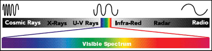
A spectrophotometer measures the amount of light reflected from a surface. The result will be a dataset of reflectance values that represents the spectral distribution of the light reflected from the point of the measurement. This means that the starting point will be at 380 nanometers (nm). The spectrophotometer then controls how much of the particular wavelength is reflected. The result will be a percentage value. This procedure is then repeated for the entire spectrum (each wavelength), and the resulting dataset can be visualized as a spectral curve. The visible spectrum normally ranges from 380 nm to 780 nm, and most spectrophotometers sample it every 10th nm (see Figure 1). These data are general and can vary depending on the device being used. When comparing data in colorimetry, it is important to consider both the structure of the device and the illumination source. A spectrophotometer is the most accurate instrument with which to measure color. The spectral distribution curve can also be used to calculate densitometric and colorimetric values. Spectral response values can be obtained in CIE XYZ and L* a* b* scales. The following equations are used by the spectrophotometer to calculate the CIE L* a* b* values ( CGATS2003, p. 28 ).
a* = 500 [(X/Xn)1/3 – (Y/Y n ) 1/3 ]
b* = 200 [(Y/Y n ) 1/3 – (Z/Z n ) 1/3 ]
where: X n , Y n , Z n : Tristimulus Values of XYZ for 2° Standard Observer
CIE Color Difference ΔE
Assessment of color is more than a numerical expression. In most cases it’s an assessment of the deviation in the color sensation (delta) from a known standard. In CIELAB color model, any two colors can be compared and differentiated. These color differences are expressed as ΔE (Delta E or Difference in Color Sensation). The following equation is used to calculate the ΔE ( CGATS. 2003, p. 29 ).
Δ ΔE = ÷(L 1 – L 2 ) 2 + (a 1 – a 2 ) 2 + (b 1 – b 2 ) 2
Research Method
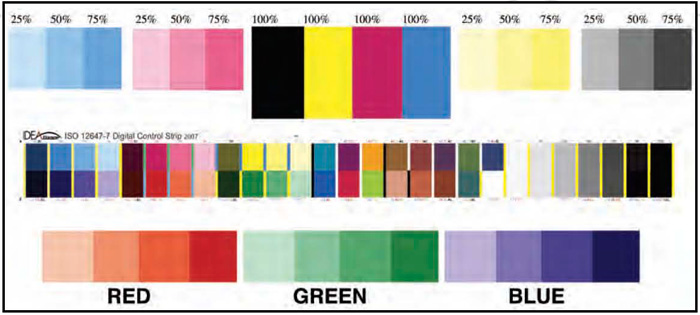
This research included an experimental research method. A layout was created for a 17.5” x 23” press sheet utilizing a custom Four-Color target. The target contained the following elements: CMYK tone scale, RGB overprints, IT8.7/3 image with 1379 patches, P2P25X image, ISO 300 image, color control bars, and other multicolor images. During the printing, these elements are used to evaluate the subjective and objective aspects of the image quality (see Figure 2). Figure 2 represents a partial portion of this test target. The data contained in this study were obtained by measuring the printed patches of this target (see Figure 2).
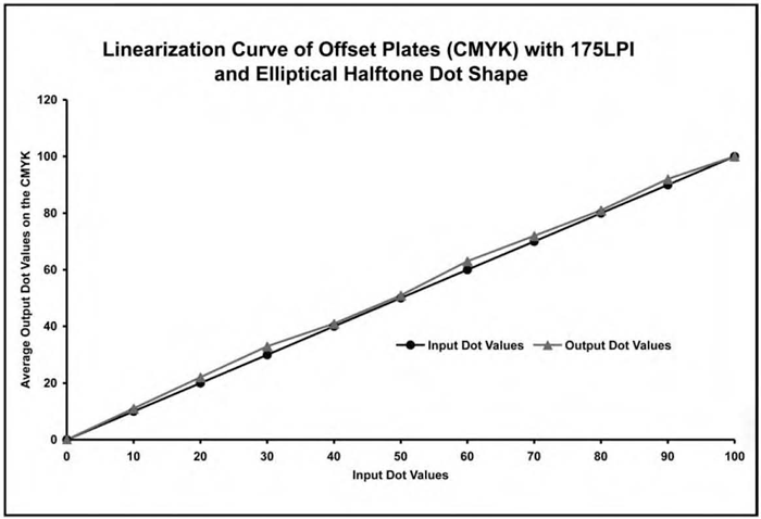
The layout was processed through Prinergy Evo Raster Image Processor (RIP). It was output using a conventional halftone screen at 175 lines per inch (LPI), with elliptical dot shape by using the Creo Trendsetter Computer to Plate (CTP) device and two sets (VO and SB inks) of linear CMYK (four) offset plates were made, each set for the two types of ink. Linear plates were made by not using the previous dot compensation curve at the RIP in order to have input dots equal to output dots. Output dot values on the plates were measured and recorded for the plate curve (see Figure 3) by using Troika LithoCam plate dot reader via the LithoCam 2.5 interface application.
After the plates were made for the SB inks, a pilot test was conducted to achieve the target ink density values according to GRACoL standards. During the pilot test, 1000 ( N ) sheets were printed. Once density values had been achieved according to the standard ink density values, the press was run continuously without operator interference and another 1000 ( N ) test sheets were printed, from which a total of 278 ( n ) sheets were randomly selected for the analysis. The machine (ink/printing units) was cleaned for the second run. Table 1 presents the variables, materials, conditions, and equipment associated with the prepress and press parts of this experiment.
| Variable | Material/Condition/Equipment |
|---|---|
| Test Image | GCM Custom 17.5” x 23” Four-Color (CMYK) |
| Page Layout | Adobe In Design CS-3 |
| RIP | Prinergy EVO |
| CTP | Creo Trendsetter 400 Quantum |
| Plate | Kodak SWORD Digital Thermal |
| Plate Processor | Kodak Polychrome |
| Plate Chemistry | Kodak Polychrome Developer and Fixer |
| Dot Reader | Troika LithoCam |
| Dot Reading Application | LithoCam 2.5.4 |
| AM Screen Line Ruling | 175 LPI |
| AM Screen Dot Shape | Elliptical Dot |
| AM Screen Angles | C = 105°, M = 45°, Y = 90°, & K = 75° |
| Target SID values (+/- 0.10) | K = 1.30, C = 1.15, M = 1.15, and Y = 0.90 |
| Achieved average SID values (+/- 0.10) | K = 1.30, C = 1.15, M = 1.15, and Y = 0.90 |
| Paper (Substrate) | Unisource 80 LBS. Uncoated |
| Solvent-based ink | Flint Sheetfed Solvent Offset Process Colors |
| Vegetable (soy bean) oil-based ink | Handschy Soybean Offset Process Colors Printing |
| Press | Heidelberg SM-74 Four Color |
| Press Speed | 6000 IMPH |
| Blanket to Impression Pressure | 0.04 to 0.10 mm |
| Ink Sweeps (KCMY) | 53, 53, 55, and 52 |
| Dampening Solution | RBP Fountain Solution |
| Dampening Solution PH | 4.5 |
| Dampening Sweeps (KCMY) | 6 |
| On-Press SID Measurement/Control | X-Rite ATD Scanning Densitometer |
| Data Collection | X-Rite 528 Spectrodensitometer |
| Press Operator(s) | Lab Manager and Students |
| Data Collection and Analysis Software | MS-Excel and ColorShop X |
The same procedures were applied for printing with the VO inks. The sample size was selected in order of the specific confidence interval (a = 0.05). A random sampling technique was used to identify the sample size because of the large size of total population. During the printing, an X-Rite ATD Scanning Densitometer was used to control the solid ink density on the press. After the printing, an n X-Rite 528 Spectrodensitometer was used to collect the colorimetric and densitometric data from the sample. Christensen (1980) provides an objective method to determine the sample size when the size of the total population is known. The total population for this study is 1000 (N) printed sheets. The following is the formula to determine the required sample size. It was determined that the sample size for this study is 278 (n) printed sheets.
n = x 2 NP (1-P) / d2 (N-1) + x2 P (1-P)
x 2 = the table value of chi-square for 1 degree of freedom at the desired confidence level (3.84)
N = the total known population size
P = the population proportion that it is desired to estimate (.50)
d = the degree of accuracy expresses as a proportion (a = 0.05)
Data Analysis and Research Findings:Vegetable Oil-based Inks vs. Solvent-based Inks
A total of 278 randomly selected samples (printed sheets) were analyzed for each set of ink. Colorimetric and densitometric data were generated by using an X-Rite 528 Spectrodensitometer from the printed sheets. Descriptive and inferential statistics were the statistical procedures used to analyze the data. An independent samples one-tailed t-test was conducted to determine if any statistical differences exist between the mean scores of print attributes (dot gain and print contrast) of both inks. Colorimetric data and Δ E was used to compare the color gamuts of both inks. In comparing the differences between two colors, a higher Δ E is an indication of a greater color variation and lesser the Δ E is an indication of less color variation. However, the subjective judgment of color difference could differ from person to person. For example, people see colors in an image, not by isolating one or two colors at a time (Goodhard & Wilhelm, 2003). In addition, people see colors by mentally processing contextual relationships among colors where the changes in lightness (value), hue, and chroma (saturation) contribute independently to the visual detection of spatial patterns in the image (A New Test Method, 2003). The results of analysis are presented in the following section.
Dot Gain
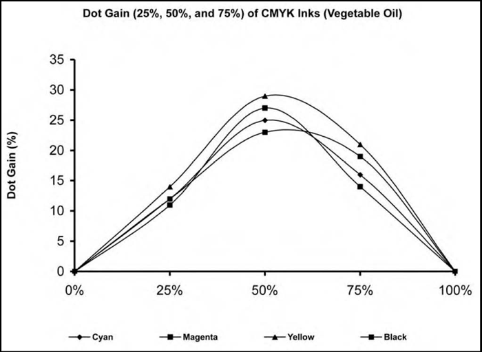
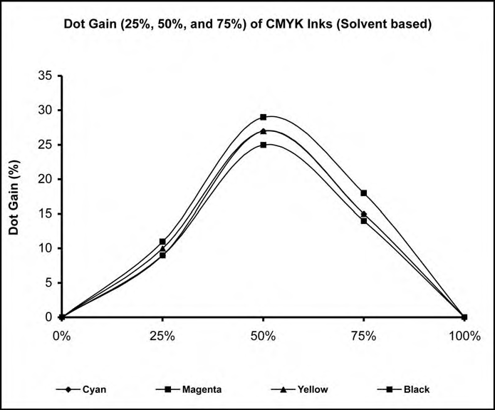
The mean scores, standard deviations, and t -values associated with the dot gain at the 50% dot area of VO and SB inks are compiled in Table 2. A significant difference was found in the dot gain at the 50% dot area when comparing the dot gain of the VO inks to that of the SB inks (CMYK). Dot gain in three (CMK) of four color inks (CMYK) of the SB inks were higher than in the VO inks, while the dot gain of VO yellow ink was higher. All details in an offset printing are achieved by the use of a halftone dot. The greatest dot gain at 50% dot area was found in the yellow VO ink and the magenta SB ink, while the black color of both inks had the smallest standard deviation when compared to the other colors (see Table 2). Even small differences in dot gain at the midtone area can lead to color shift (see Figures 4 to 6).
| Vegetable Oil | Solvent | ||||
|---|---|---|---|---|---|
| n = 278 | n = 278 | ||||
| Process Ink | M (%) | SD (%) | M (%) | SD (%) | t-value |
| *t 0.05 (554 df) = 1.648 | |||||
| Cyan | 25.00 | 2.00 | 27.00 | 3.00 | 2.00* |
| Magenta | 27.00 | 1.00 | 29.00 | 2.00 | 2.00* |
| Yellow | 29.00 | 1.00 | 27.00 | 1.00 | 12.50* |
| Black | 23.00 | 1.00 | 25.00 | 2.00 | 2.00* |
Color Variation in the Midtone (50% dot) Area of Vegetable Oil vs. Solvent-Based Inks
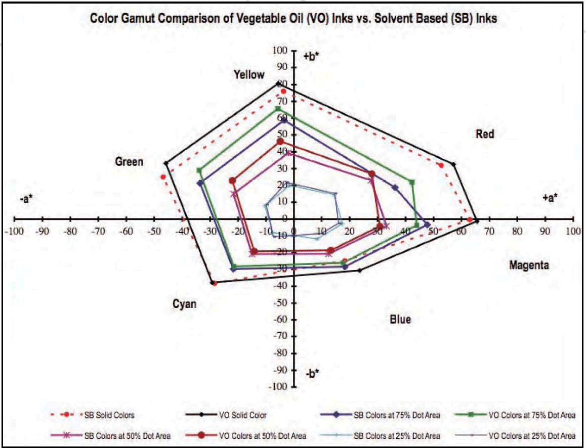
The CIE L* a* b* values associated with the CMYKRGB colors in midtone (50% dot area) color areas of VO vs. SB inks are compiled in Table 3. Numerical and visually noticeable color differences (ΔE) were found when comparing the VO inks (color) with the SB inks in the midtone area of the printed image on all seven colors (CMYKRGB). VO inks produced higher L* a* b* values in yellow, red, and green inks (bigger gamut) than for SB inks. In contrast, both inks have not produced same/similar color gamut in the midtone areas (see Figure 6), except the printed proof consists of same colors in magenta, cyan, and blue. The 2D color gamut comparison (see Figure 6) reveals a significant color difference between the two inks.
| Vegetable Oil | Solvent | Color | |||||
|---|---|---|---|---|---|---|---|
| L* | a* | b* | L* | a* | b* | Difference | |
| Color(s) | Color 1 | Color 2 | ΔE | ||||
| n = 278 | n = 278 | ||||||
| Yellow | 91.56 | -4.84 | 46.23 | 91.23 | -2.01 | 39.15 | 7.63 |
| Red | 70.43 | 27.88 | 26.95 | 72.17 | 27.63 | 22.97 | 4.35 |
| Magenta | 73.45 | 30.8 | -4.38 | 72.80 | 33.17 | -4.27 | 2.46 |
| Blue | 63.77 | 13.22 | -18.68 | 63.03 | 12.52 | -20.75 | 2.31 |
| Cyan | 74.38 | -14.21 | -19.23 | 78.69 | -15.01 | -20.88 | 4.68 |
| Green | 76.86 | -21.99 | -22.78 | 75.86 | -21.58 | 15.00 | 7.85 |
| Black | 65.09 | 0.51 | 0.64 | 69.34 | 0.89 | 1.11 | 4.29 |
Print Contrast
The mean scores, standard deviations, and t-values associated with the print contrast of vegetable oil- and solvent-based inks are compiled in Table 4. Statistically significant differences were found when comparing the print contrast of the VO to SB inks (CMYK). The print contrast in two (CM) of four color inks (CMYK) of the VO ink was higher than that of the SB ink, while the color print contrast of the black and yellow inks was higher for the SB inks. A low print contrast indicates loss of details in shadow areas, while high print contrast requires both high density and sharp printing to maintain the shadow details. Shadow details with higher print contrast were noticeably better than in the lower print contrast image. This visual result is in agreement with the print contrast values of the two inks. The largest print contrast was found in VO magenta color: 35.31% and 31.17 % for SB ink. In addition, the magenta color of the VO ink image and the black color of the SB ink image had the smallest standard deviation when compared to the other colors (see Table 4). Due to the mechanical deviation, it is possible that not all the colors have the same pattern of print contrast between the VO and the SB inks.
| Vegetable Oil | Solvent | ||||
|---|---|---|---|---|---|
| n = 278 | n = 278 | ||||
| Process Ink | M (%) | SD (%) | M (%) | SD (%) | t-value |
| *t 0.05 (554 df) = 1.648 | |||||
| Cyan | 33.06 | 2.98 | 9.72 | 3.77 | 4.23* |
| Magenta | 35.33 | 1.88 | 30.39 | 4.07 | 2.26* |
| Yellow | 22.78 | 3.42 | 27.94 | 3.13 | 17.79* |
| Black | 28.61 | 2.20 | 31.17 | 2.28 | 3.37* |
Color Variation in the Print Contrast (75% dot) Area of Vegetable Oil vs. Solvent-Based Inks
The CIE L* a* b* values associated with the CMYKRGB colors in shadow (75% dot area) color area of VO vs. SB inks are compiled in Table 5. Numerical and visually noticeable color differences (ΔE) were found when comparing the VO inks (color) with SB inks in the midtone area of the printed image on all seven colors (CMYKRGB). VO inks produced higher L* a* b* values in yellow, red, and green inks (bigger gamut) compared to SB inks. In contrast, both inks did not produce the same/similar color gamut in the midtone areas (see Figure 6) except on the printed proof, which consists of the same colors in magenta, cyan, and blue. The 2D color gamut comparison (see Figure 6) reveals a significant difference in color between the two inks.
The measured L* a* b* data was not reported for the highlight and solid colors of VO inks vs. SB inks. The values were used to construct the major color gamut (see Figure 6). The visual comparison of the gamut reveals that only the colors from the 25% dot area of the inks have the same gamut (similar or identical colors). As the dot area increases (50%, 75%, and 100%), the color shift is occurring, mostly with yellow, green, and red. In comparison, VO inks produced better colors (green, red, and yellow) than did the SB inks.
| Vegetable Oil | Solvent based | Color | |||||
|---|---|---|---|---|---|---|---|
| L* | a* | b* | L* | a* | b* | Difference | |
| Color(s) | Color 1 | Color 2 | ΔE | ||||
| n = 278 | n = 278 | ||||||
| Yellow | 90.39 | -5.75 | 65.61 | 89.86 | -3.5 | 58.77 | 7.22 |
| Red | 61.62 | 42.29 | 22 | 61.6 | 36.17 | 18.79 | 6.91 |
| Magenta | 61.67 | 44.00 | -3.73 | 63.69 | 47.78 | -3.41 | 4.30 |
| Blue | 51.94 | 17.65 | -26.04 | 52.39 | 18.29 | -28.36 | 2.45 |
| Cyan | 71.07 | -21.49 | -28.22 | 72.00 | -21.69 | -29.77 | 1.82 |
| Green | 68.38 | -33.93 | 29.02 | 67.24 | -33.64 | 21.33 | 7.78 |
| Black | 57.13 | 0.68 | 1.43 | 56.46 | 0.97 | 1.98 | 0.92 |
Conclusions and Recommendations
The conclusions of this study are based on results of the data analysis. The findings of this study represent specific printing or testing conditions. The screening technologies, paper, ink, dampening solution, film and plate imaging system, and printing process that were used are important factors to consider when evaluating the results. The findings of this study may not be generalized to other printing conditions. However, the findings of this research suggest that VO inks provide greater print contrast than do SB inks under specific printing conditions. This provides greater detail in the shadow areas (CM) of printed images. The black and yellow inks’ print contrast ran counter to this conclusion, which suggests the need to explore other factors or variables that may have contributed to this result. Variables to explore include print order or printing unit: ink color interaction.
SB inks had statistically significant higher levels of dot gain for three of the four ink colors. A lower dot gain in VO ink resulted in a better color gamut in the midtones and shadow areas. Again, further study is needed to attempt greater control of variables. A more deliberate process of press calibration would also be recommended in a future study. The margin for error is much smaller with SB inks, requiring a carefully calibrated and controlled press platform. Qualitative analysis is also something to be pursued. A panel of experts could provide qualitative analysis regarding their preference for one ink or the other.
In comparing the color gamut of both types of inks from highlight color areas to solid color areas, VO inks produced better visual colors than the SB inks. This suggests that the VO inks are environmentally friendlier and can be used for better color reproduction. This experiment revealed that the VO inks produce better colors than do SB inks. Green printing is an environmentally friendlier, healthier, and safer approach to printing that requires only a small amount of energy. The question is, how many printers are going green? Additionally, if printers are not doing so, why not? Answers to these questions would require additional study to determine the status of using VO inks in the printing industry.
Dr. H. Naik Dharavath is an Associate Professor in the Department of Apparel and Communication Technologies at the University of Wisconsin – Stout, Menomonie, WI.
Dr. Kim Hahn is an Associate Professor in the Department of Apparel and Communication Technologies at the University of Wisconsin – Stout, Menomonie, WI
References
Alternatives to petroleum- and solvent-based inks. (1997). Retrieved September 14, 2009, from The Massachusetts Toxics Use Reduction Institute Website: http://www.p2pays.org/ref/11/10142.htm
Argent, David (2009). How to become a green printer . Retrieved March 16, 2010, from Penton Media website: http://pffc-online.com/print/become_green_printer_0109/
Brehm, P. V. (1992). Introduction to densitometry: A user’s guide to print production measurement using densitometry . Alexandria, VA: Graphic Communications Association.
Christensen, L. B. (1990). Experimental methodology . Boston, MA: Allyn and Bacon.
Committee for Graphic Arts Technologies Standards [CGATS]. (1993, Reaffirmed 1998).
Graphic technology – graphic arts reflection densitometry measurements – terminology, equations, image elements, and procedures.
(ANSI/CGATS.4-1993). Reston, VA: NPES, The Association for Suppliers of Printing and Publishing Technologies.
Committee for Graphic Arts Technologies Standards [CGATS]. (2003). Graphic technology – spectral measurement and colorimetric computation for graphic arts image. (ANSI/CGATS.5-2003). Reston, VA: NPES, The Association for Suppliers of Printing and Publishing Technologies.
Eco- and mild solvent products help provide more options for output providers. (2009). Retrieved September 23, 2009, from Wide-Format Imaging Website: http://www.wideformatimaging.com/publication/article.jsp?pubId=2&id=260&pageNum=1
Evans, P. (1997). The complete guide to eco-friendly design . Cincinnati: North Light Books. Comparing inks. (2009). Retrieved October 10, 2009, from Executive Summary Website: www.pages.drexel.edu A new test method based on CIELAB Colorimetry for evaluating the permanence of pictorial images. (2003). Retrieved January 20, 2006, from Goodhard, M. M., & Wilhelm, H. Website:http://www.wilhelm-research.com.
Hsieh, Y. C. (1997). Factors affecting dot gain on sheetfed offset presses. Journal of Visual Communications, 1 (1), 37-39.
Lustig, T. (2001). Sheetfed specs proposed. Graphic Arts Monthly, 73 (7), 64-65.
Lychock, G. (1995). Dot area, dot gain, and n-factor [Brochure]. X-Rite, Incorporated.
X-Rite, Incorporated. (2003). A guide to understanding graphic arts densitometry [Brochure]. Grandville, MI: Author.