JARS v64n4 - True-color Images: An Elusive Goal
True-color Images: An Elusive Goal
Donald H. Voss
Vienna, Virginia
A common plaint of flower pho-tographers when viewing their handiwork on prints, monitors, or projection screens is: "The color of that image is not true; it should be . . ." This plaint has significance beyond a photographer's frustration: it also points to the need for - and difficulty in achieving - color accuracy in published descriptions and images of cultivar flowers. Some cultivars share so many physical characteristics that a relatively fine gradation of color must be relied upon to identify them correctly. This contrasts with botanical classification, where characters other than color usually serve to distinguish species or varieties, with color stated only in broad terms - red, yellow, purplish, etc. - if noted at all.
Concern for color accuracy in cultivar descriptions leads plant-name registrars to recommend that color citations be referenced to standard color charts. Those photographing flowers for their own records, for publication, or for educational presentations should seek to create records that convey the color of a flower as accurately as possible. Close attention to color accuracy may forestall propagation and distribution of a mislabeled plant, save a hybridizer or collector from buying one, or give warning of pitfalls in the use of digital images as an aid in cultivar identification.
“Color” has two main aspects. Color perception involves the interaction of light, an object, and the eye to produce stimuli in the brain that cause sensations known as colors. Colorants (pigments and dyes) are components of an object that selectively absorb part of the incident light, so that light reflected or re-emitted from the object toward the eye has a changed spectral composition. The colorants in flowers include flavonoids (anthocyanins and flavonols) and carotenoids. These have been discussed in this journal in articles by R. J. Griesbach (vol. 41(1)) and P. Rogers (vols. 62(2), 62(4), and 63(2)). The present article seeks to enhance understanding of the nature and role of light as these affect color perception and, thereby, to foster improved accuracy in the creation and interpretation of flower-color descriptions and images.
Some Color Basics
The quest for an understanding of color begins in a dark room. The achievement of the age, a golden yellow elepidote rhododendron would be indistinguishable (if you could find it) from R. ponticum . Indeed, what you or your camera would see is:

|
| Fig. 1. Flower color in a dark room. |
Obviously, light is needed for visual perception or photography of an object. Both processes require light (visible radiant energy) from a source (the sun, indoor lighting, photoflash, etc.) to be reflected from the object to a receptor (the eye or a camera). For color vision, the light must be sufficiently bright to activate the cones in the retina of the eye. Below that very low threshold of illumination, only the rods in the retina are active and chromatic colors are not perceived (objects will be seen as white, gray, or black).
Whether or not one's interest in flower color involves use of a color chart or a camera, some understanding of the spectral characteristics of light is important. Light may be defined as a stream of photons (quanta of radiant energy) or as energy propagated in the form of electromagnetic waves. The visible spectrum is a narrow band in the electromagnetic spectrum, which includes (in increasing order of wavelength) gamma-ray, X-ray, ultraviolet, visible, infrared, microwave, and broadcast radiation. In the late 1600s, Sir Isaac Newton saw the colors produced by radiant energy of wavelengths in the visible spectrum when he passed sunlight through a prism, yielding the sequence of red, orange, yellow, green, and blue. In the blue range (toward ultraviolet), Newton distinguished indigo and violet. The colors of the solar spectrum are seen in rainbows. Note that purple is not present in the solar spectrum; it comprises red and blue wavelengths.
Analysis of color may be visual, entailing personal judgments about hue, lightness, and chroma. For example, when one uses a color chart to evaluate flower color, the first step is to locate color patches of approximately the same hue (red, green, blue, etc.) and lightness as that of the flower. Then one narrows the search by comparing chart and flower to locate the closest approach to a match or near match in lightness (relation of the observed color to a gray scale between black and white), in hue, and in chroma (a color's degree of difference from achromatic color (gray) of the same lightness). Seldom is an exact match realized - for flowers, a compromise choice is often based on closeness in hue. Sometimes it is better to identify two color patches that bracket the flower color.
When more precise analysis of color is required, measurement of the radiant energy reflected from an object at different wavelengths across the visible spectrum is undertaken. For much color work, a measuring instrument (the spectrophotometer) samples the energy reflected from an object at wavelengths from 400 to 700 nanometers (nm; billionths of a meter), often at five or ten nm intervals. (The visible spectrum includes wavelengths from 380 nm to 780 nm, but below 400 nm and above 700 nm the color stimuli are negligible for most purposes.) A standard way of viewing the results of these measurements is to plot them on a graph showing the relative radiant power at each wavelength. The x-axis (the horizontal axis at the bottom of the graph) has 31 divisions that represent wavelengths between 400 nm and 700 nm at ten nm intervals. Figure 2 provides a general guide to the colors observable at various wavelengths of the spectrum; for example, colors in the 400-480 nm range will be seen as blues; those in the 630-700 nm range, reds.
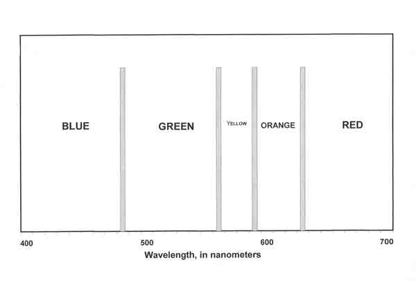
|
| Fig. 2. Wavelength bands for major colors. |
Spectral Composition of Light and its Consequences
Why be concerned about the qualities of light from different sources? As noted above, seeing color involves light, the object to be viewed, and a receptor. In visual observation or photography of a flower, one must consider that the spectral composition of light directed from the flower toward the receptor is determined by the combined effect of (1) the reflectance, transmittance, and spectral absorption characteristics of the floral tissue and (2) the spectral composition of light incident on the flower .The reflectance, transmittance, and spectral absorption characteristics of floral tissue depend on its structure and pigmentation. The exposed walls of cells in the epidermal (outside) layer may form an almost flat or a distinctly uneven surface. The epidermis is coated, sometimes relatively thickly, with cutin (a waxy substance). Depending on the surface texture and the angle of incidence of light on the flower, the surface reflects or scatters a greater or lesser amount of full - or nearly full - spectrum light toward the eye or camera. Most of the incident light will penetrate the epidermal cells, with some passing on to interior cell layers. Complex refraction, reflection, scattering, and transmission, will occur in and between cells, combined with absorption of certain wavelengths of light by constituent parts of the cells. Light exiting the petal from cells with flavonoid pigmentation will appear primarily red to purple (from anthocyanins) or pale yellow (from flavonols); from those with carotenoid pigmentation, strong yellow to orange.
The spectral composition of light from different sources varies markedly and thus may affect the color appearance of an object. The spectral properties of the incandescent (tungsten-filament) lamp (see Figure 3) differ dramatically from those of daylight. In the graph, the height of the curve at each wavelength represents the relative spectral power of the light at that wavelength. The tungsten lamp provides very little blue and very much red, resulting in a color temperature of 2856 K (see sidebar). Note that direct sunlight (4870 K) has less blue and more red than full-sky daylight (6500 K). Daylight from a cloudy sky or from blue sky alone includes even more blue and less red than full-sky daylight.
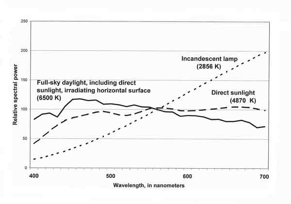
|
| Fig. 3. Relative spectral power of daylight and incandescent light (in arbitrary units). |
Metamerism
In the case of a color-chart, for example, the colorant of a particular color patch may have been formulated to create a certain color response when illuminated by light from a specified source - usually daylight. Under different illumination, the perceived color may be different - an effect known as illuminant metamerism. The author recalls an example of this metamerism: at a rhododendron show in the U. S. National Arboretum auditorium (incandescent light), a deciduous azalea that appeared yellowish Pink had been placed in the orange color class. (When a capital letter appears in a color name in this article, the name relates to a color-name block defined in the Inter-Society Color Council - National Bureau of Standards [ISCC] Method of Designating Colors.) The cultivar name on the entry card was, however, that for a purplish Pink azalea. Mislabeled? No! When examined in daylight, the flowers were purplish Pink.A house or picket fence, seen as white when illuminated by midday daylight, will reflect predominantly orange wavelengths in early morning or late afternoon sunlight. Remarkably, if one is not thinking about color analytically, the brain may compensate for the variant spectral character of the light, and house and fence may still be thought of as white (object-color constancy). The camera does not offer this psychological compensation: the image recorded will have an orange cast. An old rule of thumb is to avoid taking color photographs within two hours of sunrise or sunset if color accuracy is important.
|
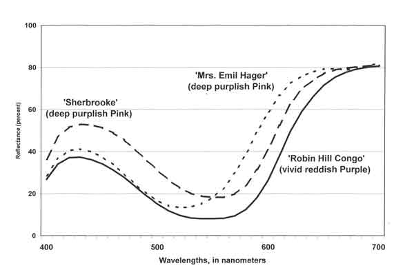
| Fig. 4. Reflectance, by wavelength: purplish Pink and reddish Purple azaleas. |
Why is One Flower Red, Another Purple?
As noted above, the spectral composition of both the incident light and the absorption of radiant energy by the flower determine what wavelengths and amounts of light are reflected or emitted toward the eye or camera. To measure the reflectance shown in Figures 4 and 5, the spectrophotometer (Minolta CM-2002) was set for D65 light source. Examples of spectral reflectivity for purplish Pink and reddish Purple flowers are shown in Figure 4. The curves for the two deep purplish Pink cultivars suggest the breadth of the hue range identified by that color name. The color of 'Mrs. Emil Hager' contains less blue and more orange and red than that of Rhododendron 'Sherbrooke', yet the same ISCC color name applies to both. In the case of R. 'Robin Hill Congo', its proportional wavelength distribution resembles that of R. 'Sherbrooke' but its reflectance across the spectrum - hence its lightness - is lower. Thus, while the two cultivars are close in hue, R. 'Robin Hill Congo' is a vivid reddish Purple; R. 'Sherbrooke', a deep purplish Pink.
|
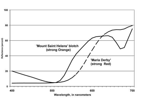
| Fig. 5. Reflectance, by wavelength: Orange and Red azaleas. |
In Figure 5, the reflectance curve for R. 'Maria Derby' shows that most of the incident light of blue and green wavelengths was absorbed by the petals. Thus, for this cultivar, the light reflected to the receptor is largely in the red portion of the spectrum. The blotch on the upper petal of R. 'Mount Saint Helens' absorbs nearly all of the blue and much green, and reflects large amounts of radiant energy in the yellow-to-red wavelength region. Of passing interest is the spike in the red wavelengths beyond 670 nm - a response that begins at 670-680 nm and extends into the near infrared, indicating the presence of chlorophyll in the blotch area of the R. 'Mount Saint Helens' flower.
Visual Images vs. Digital Images
For levels of illumination that permit perception of color, the cones in the retina of the eye react to the light reflected from the flower by sending neural signals to the brain. The cones are of three types; those of any one type are sensitive to one range of wavelengths of light—either long, medium, or short wavelengths. These wavelength bands have been referred to historically as "red, green, and blue" (trichromatic theory). A later explanation of color vision involves the aggregation, by addition and/or subtraction, of the cones' signals into three channels: black-white, red-green, and yellow-blue (opponent theory). In either case, human recognition of color starts with a neural signal from each cone that is proportional to the strength of radiant energy received in the cone's band of wavelength sensitivity. The brain processes the neural signals and, based on the relative strength of the three types of signal, produces sensations that we learn to call colors.As with visual perception, the photographic process begins with a flower and incident light. The receptor of light reflected from the flower is now the digital camera. For the purpose of discussing color rendition, the key components of the camera are the sensor and the software. In addition to managing the sensor and processing its output of signals, software provides a means (the white balance) to compensate for different spectral qualities in the light sources commonly encountered. In a film camera, such compensation requires the selection and installation of a filter or use of different film.
The camera's sensor is in some ways analogous to the retina of the eye. In the eye, each cone creates a neural signal proportional in strength to the radiant power incident upon it. The cones supply three channels of color stimulus information to the brain. The sensor has an immense number of cavities or cells. The tiny area of the picture serviced by each cell is known as a picture element or "pixel." In most digital cameras, each cell is covered with either a red, green, or blue filter. The filters are in a regular array; for example, RGRGRG and GBGBGB in alternating rows. Radiant energy reflected from the flower is focused on a cell by the camera lens, passes through the cell's R, G, or B filter, and is converted into an electrical charge proportional to the radiant power of the wavelengths received. The output from each cell is digitized and forwarded in one of three (RGB) channels. The camera software assembles the pixel data into a file that enables a display unit to produce an image.
The Worm in the Apple
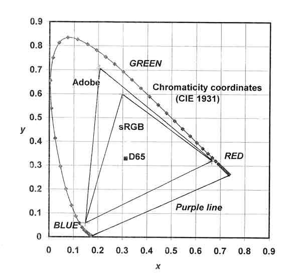
Although the eye and the digital camera both furnish three-channel color information for a given observation, it is not exactly the same information. In the human visual system, there is a large overlap in spectral sensitivity between the middle-wavelength and long-wavelength cones of the retina. The RGB filtering of the camera sensor does not match the overlap in the sensitivity bands of the eye. Further differences arise in the processing of the three channels of data. The brain reacts to neural signals from the eye to produce immediate color sensation. Digital signals from the camera must be processed by software, sent to a display device to be printed or shown on a monitor or projection screen. The resulting image is then judged for its color accuracy by a human observer—in many cases against memory color!An additional complication lies in the difference between the gamut of visually perceived colors and the RGB color space attainable on a display device; this may be shown graphically. In Figure 6, the dotted curve shows the chromaticity coordinates (CIE 1931 x and y) of spectral stimuli derived from experiments with groups of observers experienced in color science. The coordinates for daylight (D65) are also plotted. Colors near this achromatic point are very low in chroma; those near the dotted curve are nearly pure chromatic color. Because purple is not a spectral color, purples lie along a line connecting the red and blue ends of the chromaticity curve. The area enclosed by the chromaticity curve and the purple line represents the color gamut observable by a human with normal color vision.
|
| Fig. 6. Comparison of color gamuts for CIE 1931 standard observer, Adobe RGB (1998)®, and sRGB. |
Drawn inside the chromaticity curve are two RGB triangles. These are a conventional way of showing the color space associated with specified RGB values. The Adobe RGB (1998)® color space is familiar to many who have used the computer to adjust hue, lightness, and chroma in their photographs. The sRGB color space has sometimes been used as a standard in display devices including computer monitors.
The differences between the color spaces associated with direct human observation and with images from display devices seems startling, but the visual effects for most observers may be much less than the differences in area on the gamut chart seem to imply. Indeed, the range of colors produced by RGB phosphors or filters in television and computer monitor displays is quite amazing. Reliance on RGB primaries cannot, however, produce stimuli that will be seen as pure yellow or pure blue green.
Ugh! Poor Color! Who's the Villain?
We used to have a small group of targets for our darts - the film and photo-paper makers and the processors. The advent of the digital camera has dramatically increased the availability of targets for our wrath - more manufacturers and more types of equipment: the digital camera itself, storage media, computers, monitors, printers, etc. These devices rely on unique circuitry and software for their management and interconnection. Although technical standards have been developed for some aspects of the systems involved, much of the hardware and associated software technology differs between manufacturers. The following comments will not venture into the tortuous maze just described but will mention some pitfalls along the path between one's observing the color of a flower and the later viewing of a digital image.Many of the color differences between object and image seen in practice are attributable not only to characteristics of specific equipment but also to choices made by the users. Various monitors may have phosphors with different spectral characteristics in their color displays, but even monitors of the same make and model may produce variant color depending on their adjustment by users. Printers produce notoriously different color results depending on the inks and paper used. It is inescapable that our personal decisions (and pocketbooks) play a role in the outcome of the process of creating a color image.
One important decision that is critical for optimization of color accuracy in any particular array of equipment is the owner's willingness to take advantage of the adjustment options explained in the accompanying manuals or software files. To achieve more precise adjustments and create profiles to coordinate color appearance between camera, monitor, and printer, specialized equipment and software are available. The procedures involved are known as "color management." Explication of the technology is available on the Internet (search "color management") and in many books offered by Internet booksellers.
Some digital camera owners find rendition of flower color in the high-chroma Red to reddish Orange hue range to be problematic. In this hue range, whether daylight or the camera's flash is used, the reds are "hot." What has happened? Is the sensor hypersensitive to some spectral peculiarity in the reds reflected from the flower? Or - as seems likely - have the camera makers deliberately overemphasized these reds to ensure flattering skin tones on people? The distortion of reds may be mitigated somewhat by the photographer's use of camera options relating to white balance and exposure. This is, however, a tedious process that is a nuisance in the field and may negatively affect rendition of other colors in a picture.
Viewing Images
The final step in the search for accurate rendition of color is viewing a processed image. Attention to viewing and illuminating conditions is essential. One should not attempt close color judgments between a luminous image and a reflected image. Color comparisons call for identical illumination of the objects being compared; otherwise, the visual system tends to undergo change in response to the spectral quality of different lights or in response to different levels of illumination. The achromatic (white) point for a computer monitor may be in the 9,000-10,000 K range, while - if indoors - the flower, print, or color chart of interest is often illuminated by light from a 2,856 K incandescent source.Ideally, the print of a photograph taken in daylight should be judged in daylight if "true color" is the objective. There may, of course, be times when prints are to be exhibited under incandescent or fluorescent illumination. In such cases, judgment of print color should be carried out under the lighting to be used for viewing (but be alert for metamerism). When the subject of a photograph is not available for comparison with the print under this lighting, "memory color" comes into play: the viewer must rely on memory to judge the accuracy of the color.
Acknowledgments
The author thanks Dr. Robert J. Griesbach. Dr. John W. Root, Ms. Sonja Nelson, and Mr. William C. Miller III for reading and commenting on the article. Any errors or infelicities are the responsibility of the author.References
Berns, R.S. 2000. Billmeyer and Saltzmann's principles of color technology. Third ed. New York: John Wiley & Sons. 247 pp.
Judd, D.B. and G. Wyszecki. 1975. Color in business, science, and industry. Third ed. New York: John Wiley & Sons. 553 pp.
Kelly, K.L. and D.G. Judd. 1976. Color: Universal language and dictionary of names. Nat. Bur. Stand. (U.S.), Spec. Publ. 440. Washington, D.C.: U.S. Government Printing Office. 158 pp.
Wyszecki, G. and W.S. Stiles. 1967. Color science: Concepts and methods, quantitative data and formulas. New York: John Wiley & Sons. 628 pp.