JDC Spring-2002 v4 - The Elements of Text and Message Design and Their Impact on Message Legibility: A Literature Review
The Elements of Text and Message Design and Their Impact on Message Legibility: A Literature Review
Laura Bix
Assistant Professor
Michigan State University
School of Packaging
153 Packaging Building
East Lansing, MI 48824
517-355-4556
bixlaura@msu.eduABSTRACT:
When creating messages, designers must be careful to not affect basic letters, thus weakening communication ( Craig, 1980 ). The challenge is to make the most effective use of the enormous flexibility that is inherent in typographic design ( Bigelow & Day, 1983 ) by creating designs that are both interesting and practical. Effective designers develop a high level of awareness of typeface in order to construct messages that not only attract readers, but allow them to easily read and understand the message created. This awareness consists of a basic understanding of the "anatomy" of letters, the messages they form, and the impact that changes in letter design and word layout has on message accessibility. The article presented here reviews the elements of letter and message design and the impact of each on the legibility of printed text.
INTRODUCTION:
The major function of textual messages and graphic elements is communication. The graphic/text combination can evoke emotional responses or convey information for purposes as varied as motivating a sale to furthering a cause. According to Rousseau ( 1998 ), four steps of interaction between the viewer and the design must be successfully completed for a design to effectively convey its meaning. Rousseau ( 1998 ) states that successful messages are,
- noticed
- encoded [decoded]
- comprehended
- complied with by the viewer
Failure at any of these steps diminishes the design's ability to effectively communicate, and therefore, achieve its intended goal. Although graphic designers do not frequently have control over steps three and four of the model, their influence over the success, or failure, of steps one and two is significant. Because communication is paramount, and typeface selections are vast, it is important that designers consider the individual elements of text and message design and how these elements interact to determine a message's legibility.
LETTER DESIGN AND LEGIBILITY:
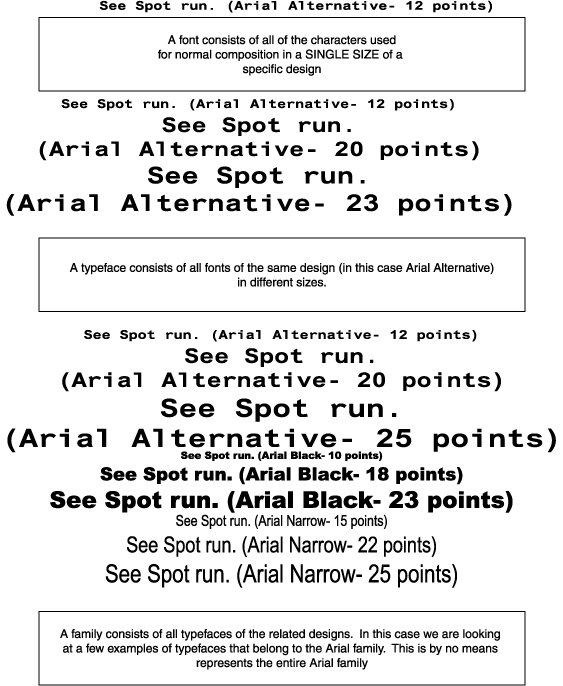
Textual messages are usually constructed of words consisting of two cases, upper and lower, which are set in a single font (See Figure 1). "A font consists of all the characters (upper and lowercase, figures, fractions, reference marks, etc.) of one size of one particular typeface" ( Craig, 1980 ). Typeface (see Figure 1) is defined as the full range (of sizes) of type of the same design (Department of Mathematics, University of Utah, 2001). In other words, a typeface consists of all characters, in all sizes, of a particular design. "Typefaces are usually available in 6- to 72-point [one point is equal to 1/72"], with a complete font in each size" (International Paper, 1997). A family of type encompasses all related typefaces (see Figure 1).
Figure 1 Font, Typeface and Family
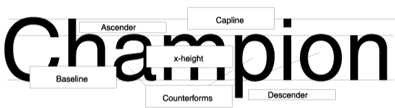
There are several common elements of letters that can be examined. These include x-height, ascenders and descenders, counter forms (also called counters), serifs (or lack of serifs, referred to as sans serif), and stroke weight (thick and thin). The terms x-height, ascender and descender refer only to lower-case letters, while counter forms, serifs, and stroke weight apply to both upper and lower case letters.
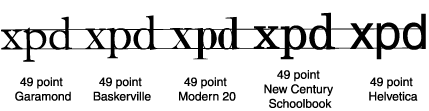
X-height refers to the height of the body of a lowercase letter. It is called the x-height because it is equal to the height of the lowercase x (see Figures 2 and 10).
"Although the x-height is not a unit of measurement, it is significant because it is the x-height - not the point size - that conveys the visual impression of the size of the letter. Typefaces of the same point size may appear larger or smaller because of variations in the x-height" (see Figure 2) ( Craig, 1980 ).
Figure 2 Comparing the x-heights of various fonts
Despite the fact that it is the x-height, rather than the point size, that conveys the visual impression of letters ( Craig, 1980 ), point size is, perhaps, the letter characteristic that is most frequently manipulated to improve legibility. While there is some validity to the argument that increasing type size improves legibility, to say that type size determines legibility is an oversimplification. The design elements of letters, and the way they are presented, can have a far greater impact on legibility than size of the type.
A study conducted at the New England College of Optometry ( Watanabe, 1994 ) found elements other than type size had a more significant impact on legibility. "Type size alone may not be responsible for poor readability. Other factors that may be contributing to this difficulty include letter and line spacing, letter contrast, print and background color, and type style" ( Watanabe, 1994 ). The study concluded, "horizontal letter compression had a greater effect on readability than vertical letter height."
An experiment conducted at the Michigan State University School of Packaging ( Lockhart & Bix, 1997 ) also suggests that more factors influence legibility than type size. A message in 4.5 point type with black on white contrast was more easily read than the same message printed in 6 point type with yellow on red contrast. These results indicate that color contrast can have a greater impact on legibility than type size.
Additionally, different typefaces that are "the same" size can vary greatly in their legibility. This is not only due to the fact that they can have different x-heights, but also because of the system used to determine typeface size. The size of a given font is based on the now-antiquated system of setting metal type. Metal type setting was the technique used when letterpress, a type of relief printing, was the only way to print text. In letterpress printing, each letter is raised from the surface of a metal block (see Figure 3). The block is referred to as the body; the printing surface (the letter) is referred to as "the face" ( Craig, 1980 ). Type size is based on the size of the block from which the letter is raised and is not directly related to the height of the letter.
The discrepancy occurs because different typefaces utilize different areas of the block, and even though type is now created using computer programs, type size is still based on the letterpress system. As a result, a type size of "6 points" does not produce a letter that is 6 points in height. Typefaces that utilize a large percentage of the block are close to 6 points tall. Typefaces that do not use as much of the block are much shorter, but they are still referred to as 6 point type.
Figure 3 Diagram of a block of type
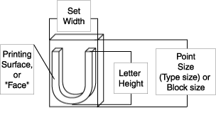
As a result, "the face of any letter is not the full point size…. Corresponding letters in the same size type may vary in height" ( International Paper, 1997 ). "No type face fills the amount of space allowed in its measure, e.g. a type face in 10 point may print a letter only 6 points high; another type face in 10 point will print a letter 8 points high" ( Ralph, 1982 ).
Organizations have frequently believed that they could ensure legibility by specifying a minimum type size ( Food and Drug Administration, February 27, 1997; Food and Drug Administration, March 17, 1999 ; Nonprescription Drug Manufacturer's Association, 1991 ). This approach has problems, not only because of the issues associated with varying type heights and x-heights, but also because there is no agreement with regard to the minimum legible type size. The manufacturers of nonprescription drug products ( Nonprescription Drug Manufacturer's Association, 1991 ) indicate that the minimum legible type size is 4.5 points, while the Food and Drug Administration ( February 27, 1997; March 17, 1999 ) suggests nothing smaller than 6 points. Hauptman ( 1979 ) recommends a minimum of 7 points, while Jewler ( 1981 ) suggests sizes no smaller than 10 points. If visually limited persons are considered, it is suggested that a minimum of 12 points be used ( Ralph, 1982 ). Ensuring design legibility by specifying a minimum type size is not advised.
Other design elements that impact legibility include: counter forms, the presence or absence of serifs, and variations in stroke thickness, referred to as " stroke weight". These elements apply to both upper and lower case letters. Although most readers do not have a conscious awareness of the negative spaces within letters, also called counter forms or counters (see Figures 4 and 5), the design of these spaces significantly impacts letter identification and, therefore, legibility. Both the negative and positive spaces of each letter work in concert to allow viewers to identify letters at a glance.
Figure 4 Counter forms of various typefaces
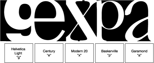
Figure 5 Small counter forms vs large counter forms
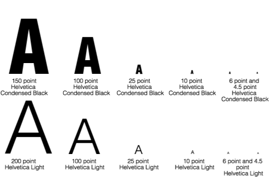
A comparison of the two typefaces in Figure 5 reveals that a typeface with large counter forms, like Helvetica Light, is easier to read at smaller sizes when compared with a typeface that contains smaller counter forms, like Helvetica Condensed Black. This is because the counter forms of the letter are not "swallowed up" as letter size decreases; readers are able to use both positive and negative spaces to identify the letter.
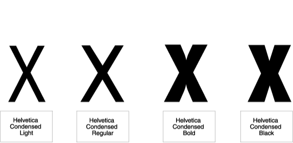
Letters are produced in a wide variety of stroke weights (see Figure 6). Possible weights, arranged from lightest to heaviest, are: hairline, extralight, light, book, regular, medium, demibold, semibold, bold, extrabold, heavy, black, ultra and poster (weights that appear in bolded type are pictured below) ( Department of Mathematics, 2001 ). Letters with thinner strokes are characterized by more open counter forms than their thicker counter parts (see Figures 5), allowing readers to use the positive and negative spaces for easy letter identification at small type sizes ( Craig, 1980 ).
Figure 6 Letters with varying weights
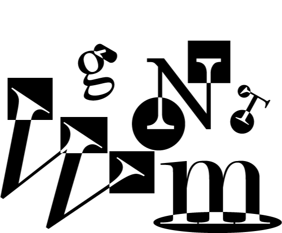
Legibility is also affected by the presence, or absence, of serifs (See Figures 7 and 8, respectively). Serif fonts have terminal strokes that are short cross lines at the end of the main stroke ( International Paper, 1997 ). "Serifs originated with the Roman masons who terminated each stroke in a slab of stone with a serif to correct the uneven appearance made by their tools" ( Craig, 1980 ). Sans (without) serif fonts do not contain these terminal strokes.
Figure 7 The Serifs of a Variety of Typefaces
Literature reviewing how serifs impact legibility is divided. Many works indicate that serifs positively contribute to message legibility, while others indicate that sans serif typefaces are more easily read.
Researchers who believe serifs contribute positively to legibility ( Burt, 1959 ; Craig, 1980 ; McLean, 1980 ; Perles, 1977 ; Rehe, 1990 ; Tinker, 1963 ; Vanderplas & Vanderplas, 1980 ; Wright, Warner, Winter, & Zeigler, 1977 ) generally provide two reasons for the improvement of legibility when using serif types: (1) "They (serifs) contribute effectively to the horizontal movement of the reading eye and thus help in combining separate letters into word-wholes" ( Perles, 1977 ) (2) Letters with serifs (See Figure 7) are more easily differentiated by readers than letters without serifs (sans serif: see Figure 8).
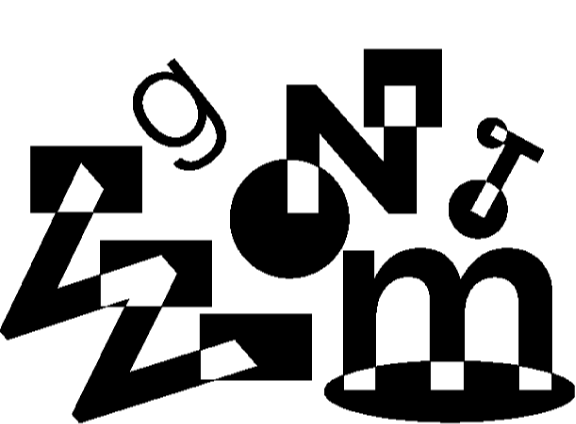
Figure 8 Sans serifs in a variety of typefaces
Researchers who support the legibility of sans serif types ( Bix, 1998 ; Food and Drug Administration, February 27, 1997; Food and Drug Administration, March 17, 1999 ; Nonprescription Drug Manufacturer's Association, 1991 ; Pietrowski, 1993 ) generally provide the following explanations for improved legibility in the absence of serifs. "Sans serif type is free of visual distractions" ( Garcia, 1981 ), which improves legibility. Additionally, the x-heights of sans serif fonts are frequently greater than the x-heights of serif fonts of equal point size; this increase allows for more open counter forms, filling more of the space provided by the type size measure, improving legibility.
MESSAGE DESIGN AND LEGIBILITY:
The preceding discussion involves the elements that come together to create letters. However, messages are not merely letters. Letters must be integrated into words to be used to convey meanings through messages. Legibility is affected not only by the design of the letters, but also by the way that they are presented. Several elements of the presentation, or layout of the letters and words, can impact the reader's ability to access the information effectively.
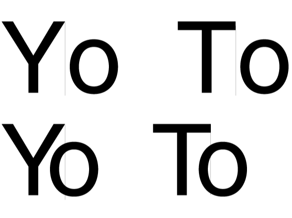
"Letter spacing is the amount of space used between letters, negative or positive, either for readability, aesthetics or to fill a certain area" ( International Paper, 1997 ). Historically, in letterpress printing, which used "…metal type, letter spacing is [was] accomplished mechanically by inserting pieces of metal between the type" ( Craig, 1980 ). Currently, letter spacing is accomplished by using computer programs to adjust the distance between letters. Because designers no longer have the physical limitations imposed by a metal block (see Figure 3), negative spacing between letters is now possible. "Negative letter spacing involves the removal of space between letters individually (kerning) or between all letters equally (white space reduction or tracking)" ( International Paper, 1997 ). Letter combinations that typically allow kerning (negative spacing between pairs of individual letters) include: we, We, yo, Yo, wa, Wa, Ta, To, ye, Ye, wo, Wo, va, Va, WA, VA ( International Paper, 1997 ). The first letter in each of these two letter combinations provides a negative space that allows for the "overlap" of the two letters in the form of kerning (see Figure 9).
Figure 9 Kerning (Negative letter spacing between specific pairs of letters)
Although letter spacing is widely recognized to impact legibility, there is little documentation with regard to specific requirements for legible messages. Glenn Pettit, an instructor of package printing at Michigan State University, indicates that legibility is most dramatically reduced when negative spacing is prevalent ( Pettit, 2000 ).
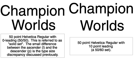
The space between lines of type, leading, also impacts message legibility. Leading is measured from baseline to baseline (see Figure 10) and is expressed in points or fractions of a point.
Figure 10 Ascenders, descenders and x-height
"The amount of space or leading used in printing is usually 0 to 2 points depending on the typeface used" ( Ralph, 1982 ). 50-point type with no lead is written as 50/50; the type size is 50 and the distance between baselines (see Figure 11) is 50. 50-point type with 10
points of leading is written 50/60 (see Figure 11). The type size is 50 and the distance between base lines is 60; 10 points of leading is used.
Figure 11 Examining Differences in Leading
The vast majority of the literature indicates that the optimal amount of leading for maximum legibility is dependent on the elements of both letter and message design.
"There is no set rule to follow [with regard to appropriate lead]… Too much leading can sometimes be as bad as not enough. Typefaces with long ascenders and descenders [see Figure 10] require more leading. Also, the wider the measure of text composition, the more leading is required for good readability" ( International Paper, 1997 ).
Ascenders and descenders are not the only aspects of typeface that dictate differences in leading, "serif type calls for less leading than sans serif type because the serifs reinforce the horizontal eye flow. Bolder typefaces require more leading than lighter faces" ( Rehe, 1990 ). Typographical researchers Becker et al. ( 1970 ) agree that optimal leading is dependent on a variety of design factors, "different typefaces need different amounts of leading."
In another area that impacts the legibility of messages, color contrast, the majority of research findings are consistent: dark text on a light background provides the best legibility. A study conducted at Michigan State University ( Lockhart & Bix, 1996 ) examined the legibility of 6 color combinations: black type on a white background, blue type on a yellow background, white type on a blue background, blue type on a white background, yellow type on a red background and black type on a red background. Black type on a white background proved the easiest combination to read for all age groups tested (six age groups ranged in age from 19 to 81). Research conducted by Sorg ( 1985 ) concurs that black on white is the easiest combination to read. Arnold ( 1972 ) and Summer ( 1932 ) found dark ink printed on yellow background to be the best contrast, while the Institute of Grocery Distribution ( 1994 ) supports "dark print on a light background." The work of Bradley et al. ( 1994 ) concurs with all of the aforementioned findings, indicating that black text on either a white or yellow background provides good legibility; they also suggest that these combinations avoid difficulties associated with red/green color blindness so that messages are accessible to a large percentage of the population.
Substrate color is not only a factor in color contrast; it also affects the color of the printed text and graphics. International Paper ( 1997 ) advises, "Type is more easily read against a soft (yellowish) white, while process colors reproduce most accurately on neutral white paper." As a result, the optimal printing substrate for a textually oriented design may be quite different than one that is graphically loaded.
CONCLUSION:
It is paramount that designers remember that messages must not only attract readers, they must also be legible. Too often form takes precedence over function; designs are produced that are sufficiently noticeable (step 1 of Rousseau's model), but not sufficiently legible (step 2 of the Rousseau model). When the viewer cannot accomplish the four steps of Rousseau's model, the message does not accomplish its intended purpose. Effective designers develop sensitivity to typeface design and message layout, and recognize that they must strike a delicate balance between form and function.
Although it is important to remember that legibility is the overall goal in a complex system of interrelated elements that are difficult to dictate one by one, designers can use some general guidelines when creating with text.
- x-height, not point size, "conveys the visual impression" of a letter ( Craig, 1980 ).
- Letter compression has a greater impact on legibility than type size; legibility is significantly diminished when compression is high ( Watanabe, 1994 ).
- At small sizes, heavier strokes cannibalize counter forms, diminishing legibility.
- Negative letter spacing should be used cautiously.
- Dark text on a light background is desirable.
- Optimal leading is dependent on the design of your typeface and the layout of your message.
The parts, or the individual elements of design and layout, do not determine legibility; sufficient legibility is the outcome of the sum of the parts. Be aware of the elements text and message design and their interactions, remembering that viewers must complete four steps of interaction ( Rousseau, 1998 ) for your message to accomplish is goal.
REFERENECES:
Arnold , E. (1972). Ink on Paper . New York: Harper and Row Publishers.
Becker , D., Heinrich, J., von Sichowsky, J., & Wendt, D. (1970). Reader Preferences for Typeface and Leading. The Journal of Typographic Research , 4(1), 61-66.
Bigelow , C., & Day, D. (1983). Digital Typography. Scientific American , 249(2).
Bix , L. (1998). The Effect of Subject Age on Legibility . Unpublished Master's Thesis, Michigan State University, East Lansing.
Bradley , B., Singleton, M., & Li Wan Po, A. (1994). Readability of patient information leaflets on over-the-counter (OTC) medicines. J Clin Pharm Ther , 19(1), 7-15.
Burt , C. (1959). A Psychological Study of Typography . London England: Cambridge University Press.
Craig , J. (1980). Designing with Type: A Basic Course in Typography . New York: Watson-Guptill Publications.
Department of Mathematics, U. o. U. (2001). Font Name [Web Page]. Retrieved August 15, 2001, 2001, from the World Wide Web: http://www.math.utah.edu/docs/info/fontname_toc.html .
Food and Drug Administration. (February 27, 1997). Over-the-Counter Human Drugs; Proposed Labeling Requirments, Federal Register .
Food and Drug Administration, F. (March 17, 1999). Final Rule-Over-the-Counter Human Drugs; Labeling Requirements, Federal Register .
Garcia , M. (1981). Newspaper Design . Englewood Cliffs: Prentice-Hall, Inc.
Hauptman , D. (1979). Effective Direct Response Typography. Direct Marketing , 42(8), 24-28.
Institute of Grocery Distribution. (1994). Packaging Design: Improving Legibility .
International Paper. (1997). Pocket Pal: A Graphic Arts Production Handbook (17th ed.).
Jewler , J. (1981). Creative Strategy in Advertising . Belmont: Wadsworth Publishing Co.
Lockhart , H., & Bix, L. (1996). Color Contrast Studies . From unpublished file.
Lockhart, H., & Bix, L. (1997). Comment to FDA on Proposed Rule. From unpublished file.
McLean , R. (1980). The Thames and Hudson Manual of Typography: Thames and Hudson, Ltd .
Nonprescription Drug Manufacturer's Association. (1991). Label Readability Guidelines .
Perles , P. (1977). Readability, Has It Gone? Or, Pity the Poor Reader. Direct Marketing , 39(10), 32-40.
Pettit , G. (2000). PKG 330 (Package Printing) Lecture. East Lansing: Michigan State University.
Pietrowski , J. (1993). Development of a Methodology to Quantify Package and Label Legibility . Unpublished Master's Thesis, Michigan State University, East Lansing.
Ralph , J. (1982). A Geriatric Visual Concern: The Need for Publishing Guidelines. Journal of the American Optometric Association , 53(1), 43-50.
Rehe , R. (1990). Newspaper Typography Some Do's and Don'ts, Step-by-Step Graphics: Designer's Guide (pp. 116-121).
Rousseau , G. K. (1998). Designing warnings to compensate for age related changes in perceptual and cognitive abilities. Psychology & Marketing , 15(7), 643.
Sorg , J. (1985). An Exploratory Study of Typeface, Type Size and Color Paper Preferences Among Older Adults . Unpublished Master's Thesis, Pennsylvania State University.
Summer , F. (1932). Influence of Color on Legibility of Copy. Journal of Applied Psychology , 16, 201-204.
Tinker , M. (1963). Legibility of Print . Ames: Iowa State University Press.
Vanderplas , J., & Vanderplas, J. (1980). Some Factors Affecting Legibility of Printed Materials. Perceptual and Motor Skills , 50(1), 1923-1932.
Watanabe , R. K. (1994). The Ability of the Geriatric Population to Read Labels on Over-the-Counter Medication Containers. Journal of the American Optometric Association , 65, 32-37.
Wright , J., Warner, D., Winter, W., & Zeigler, S. (1977). Advertising . New York: McGraw-Hill Book Company.