JDC Spring-2003 v5 - Juried Articles - The Effect of Color Contrast on Message Legibility
The Effect of Color Contrast on Message Legibility
Laura Bix
Michigan State University
bixlaura@msu.edu
Hugh Lockhart
Michigan State University
lckhrt@msu.edu
Fernando Cardoso
Michigan State University
cardosof@msu.edu
Susan Selke
Michgan State University
sselke@msu.edu
Abstract
It is widely understood that varying the color of background and type in printed matter affects legibility, but decisions about color contrast are frequently based on qualitative, rather than quantitative assessments. Using a technique developed at the Michigan State University School of Packaging, quantitative values for the legibility of 6 color combinations: black type on a white background, blue type on a yellow background, white type on a blue background, blue type on a white background, yellow type on a red background and black type on a red background were determined for six age groups. Two distinctly different levels of legibility were found: one acceptable, the other probably not.
Introduction
Researchers agree that varying the color of background and type in printed matter affects legibility (Arnold, 1972 ; Bradley, Singleton, & Li Wan Po, 1994 ; Food and Drug Administration, March 17, 1999 ; Institute of Grocery Distribution, 1994 ; Lockhart & Bix, 1997 ; Sorg, 1985 ; Summer, 1932 ). Typically, conclusions about the effect of color contrast on legibility are based on qualitative methods. Legibility is rarely, if ever, quantified.
The Michigan State University School of Packaging has developed an instrument referred to as the "Lockhart Legibility Instrument" (LLI) that quantifies how easy, or difficult, messages are to read. In the study presented here, the LLI was used to rank the legibility of 6 different color contrasts: black type on a white background, blue type on a yellow background, white type on a blue background, blue type on a white background, yellow type on a red background, and black type on a red background.
Materials and Methods
The LLI is essentially a large box with two light sources inside (see Figure 1).
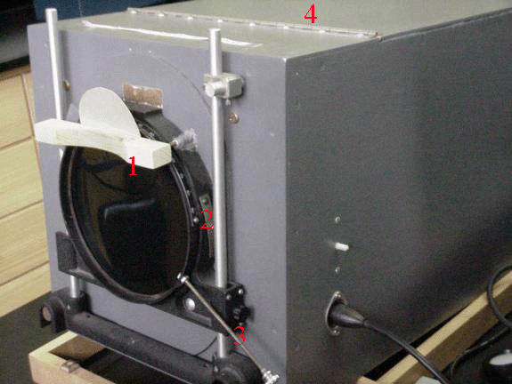
Figure 1 - The Lockhart Legibility Instrument (LLI)
1. Head Rest
2. Viewing Screen (Pair of Polarizing Filters)
3. Handle- As subjects rotate the handle counter clockwise, they rotate the
analyzing filter (relative to the polarizing filter), increasing the light to subject.
4. Hinged Lid- Items are loaded into the LLI through the hinged lidPrinted items to be read are placed on an easel (see Figure 2) located inside the LLI. Two 25-watt incandescent floodlights illuminate the test material (see Figure 2). Power to the floodlights and, ultimately, the light level inside the LLI, is controlled by a rheostat and is adjusted before testing each subject. For this experiment, the inside level of light was adjusted to 25 ± 1 foot-candles, measured by an A.W. Sperry light meter placed on the easel (see Figure 3).

Card to be read is placed on easel inside the LLI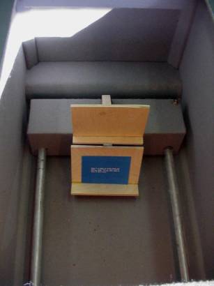
Easel illuminated with two 25 watt incandescent flood lightsFigure 2 - Inside the Lockhart Legibility Instrument (LLI)
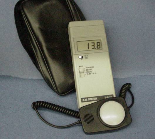
Figure 3 - A.W. Sperry Light MeterThe viewing screen that the subject looks through (see Figure 1) is made of a pair of polarizing filters. Subjects begin by rotating a handle to their right; as they rotate the handle, the filter closest to them also rotates, gradually increasing the amount of light that reaches the test subject's eyes. Messages that are difficult to read require more light; therefore, difficult messages require the subject to rotate the filter further. The "legibility index", or degree of filter rotation, thus provides a quantitative measure of message legibility: the higher the index, the less legible is the message. As a result, legibility can be quantified.
Six messages, in six contrasts (see Figure 4 and Tables 1 and 2) were printed on 3" * 5" cards for a total of 36 treatments. All messages were created using 10 point Univers.
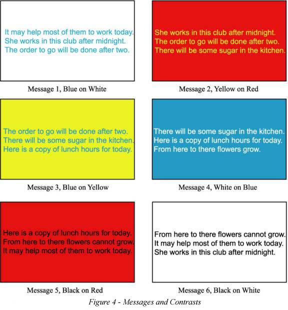
It is important to note that the font that appears in Figure 4 has been enlarged for illustration purposes and does not represent the actual size used in the study. Additionally, color was matched using Adobe Illustrator and is not a direct match of the Pantone Matching System (PMS) colors used in the study. Table 1 shows the PMS colors used to create the cards that were tested.
Table 1
Pantone Matching System (PMS) Colors UsedContrast Combination Text Color PMS Number Background Color PMS Number Blue on White Blue 312 White --- Yellow on Red Yellow 122 Red 186 Green on Yellow Green 364 Yellow 817 White on Blue White --- Blue Process Black on Red Black --- Red 186 Black on White Black --- White ---
Table 2 - Treatment Combinations Card # Color #/Message # Card # Color #/Message # 1 1/1 19 4/1 2 1/2 20 4/2 3 1/3 21 4/3 4 1/4 22 4/4 5 1/5 23 4/5 6 1/6 24 4/6 7 2/1 25 5/1 8 2/2 26 5/2 9 2/3 27 5/3 10 2/4 28 5/4 11 2/5 29 5/5 12 2/6 30 5/6 13 3/1 31 6/1 14 3/2 32 6/2 15 3/3 33 6/3 16 3/4 34 6/4 17 3/5 35 6/5 18 3/6 36 6/6
Color 1 = Blue text on a white background Color 2 = Yellow text on a red background Color 3 = Blue text on a yellow background Color 4 = White text on a blue background Color 5 = Black text on a red background Color 6 = Black text on a white background (see Figure 3 for message designation) Six age groups of subjects (19-28, 29-38, 39-48, 51-60, 61-70 and 71 and older) were tested to measure the legibility of the 36 cards using the Lockhart Legibility Instrument (LLI). Subjects were divided into age groups because previous research has shown that there is an effect of age on measurements taken using the LLI (Bix, 1998 ). This effect is partially attributed to the yellowing of the retina, lens and vitreous humor yellow with age causing colors such as violet, blue and green to be filtered out, reducing the contrast sensitivity of the eye (Kelly, 1993 ) and increasing the requirement for light in older subjects (Bix, 1998 ). The effect of age on measurement data is further compounded by a reduced ability of the iris to dilate, under all light conditions (Kelly, 1993 ). Both factors have the potential to impact the results obtained when using the LLI to measure legibility.
Usable data was obtained for 120 subjects. Because research was conducted in a university setting, subjects from age group one (19-28 year olds) were most easily obtained relative. Therefore, age group one had 45 subjects, while all other age groups had only 15. Demographic information recorded included the gender, age, requirement for eye wear, and educational background of each subject. Visual acuity was tested and recorded using a near point visual acuity card manufactured by Dow Corning Ophthalmics (see Figure 5). Visual acuity results were used in the statistical analysis to test the effect of varying visual acuity on required degrees of rotation. Subjects were also tested for color blindness using pseudo-isochromatic plates manufactured by Richmond Products. Results were recorded as "normal" or "red/green color blind." Data collected from subjects who tested as color blind was not included in the analysis.
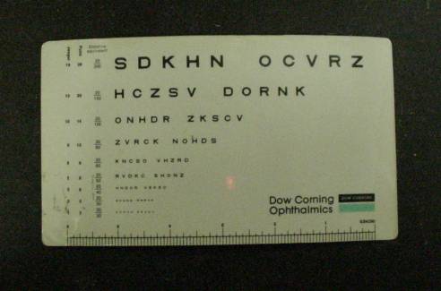
Figure 5 - Dow Corning Opthalmics Card for Measuring Near Point Visual ActivityAfter informed consent had been obtained, and the subjects' visual acuity and ability to perceive color had been tested, they were seated in front of the LLI and asked to look through the viewing screen. They were told to rotate the handle located on their right counter-clockwise until the first point that they could read the message on the card without straining their eyes. Rotating the handle rotated the filter closest to the subject, the analyzer, relative to the polarizer, gradually increasing the amount of light reaching the subject. The degree to which the filter rotated, the "legibility index", was recorded. Again, the higher the legibility index, the more difficult the text is for the subject to read; items that are easy to read do not require a large degree of filter rotation.
Results
Average legibility indexes were calculated for each contrast treatment and age group (see Figures 6 and 7). Group 1 represents results obtained from subjects age 19-28; group 2 represents results from subjects age 29-38, etc.
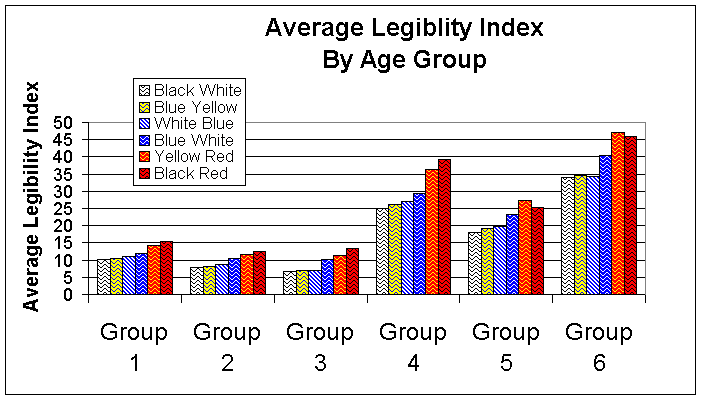
Figure 6 - Average Legibility Index by Age Group
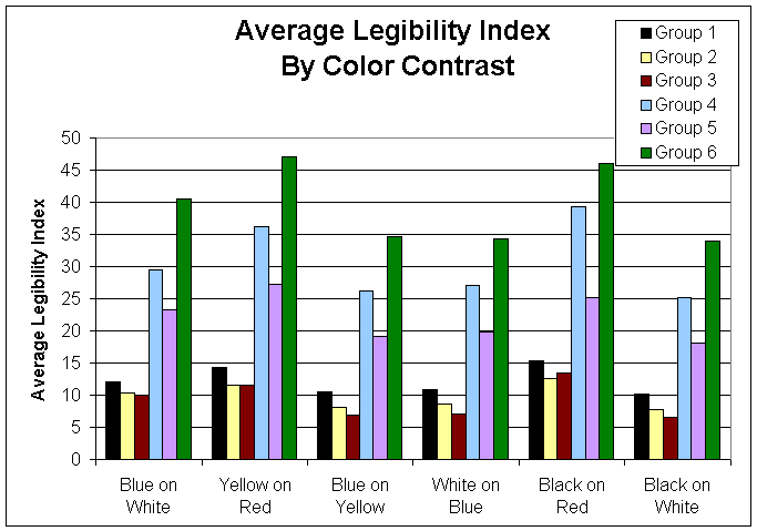
Figure 7 - Average Legibility Index by Color ContrastNot surprisingly, black text on a white background was the most legible contrast combination for all age groups. This is consistent with the findings and recommendations of others that recommend dark text on a light background as the most legible (Arnold, 1972 ; Bradley et al., 1994 ; Food and Drug Administration, February 27, 1997 ; Food and Drug Administration, March 17, 1999 ; Institute of Grocery Distribution, 1994 ; Sorg, 1985 ).
Although there was a significant effect of age group on the results (see Figure 6 and Table 3), the relative ranking of the color combinations, in terms of difficulty for readers held more or less constant (see Figure 7 and Table 3).
Table 3 - Average Results by Age Group
(Table entries are Legibility Index, Degrees of Rotation)Group
1Group
2Group
3Group
4Group
5Group
6Black Text on White
Background10.1 7.8 6.6 25.1 18.2 34.0 Blue Text on Yellow
Background10.6 8.1 6.9 26.3 19.1 34.7 White Text on Blue
Background10.9 8.6 7.0 27.1 19.9 34.3 Blue Text on White
Background12.0 10.4 10.0 29.5 23.3 40.4 Yellow Text on Red
Background14.4 11.6 11.5 36.2 27.2 47.0 Black Text on Red
Background15.3 12.6 13.5 39.3 25.2 46.0 Every age group found black type on white the easiest to read, and all but the two oldest groups (group 5, age 61-70 and group 6, age 71 and older) found black type on a red background to be the most difficult to read. The two oldest groups found yellow text on a red background the most difficult to read, possibly because of the physiological changes discussed earlier in this document combined with the poor contrast provided by this combination.
Data was analyzed statistically using the following model:
Response = Age Group + Visual Acuity + Eye Wear + Gender + Color + Age Group * Color + Message + Subject (Nested within Age Group) + Subject (Nested within Age Group) * Color + Residual
The model returned the results listed in Table 4.
Table 4 - Analysis of the Complete Data Set Fixed Effects Effect Degrees of Freedom Degrees of Freedom F Value Pr > F Age Group 7 105 5.70 < 0.0001 Visual Activity 3 105 21.13 < 0.0001 Eye Wear 3 105 1.17 0.3236 Gender 1 105 0.01 0.9274 Color 5 561 177.28 < 0.0001 Age Group * Color 35 559 6.57 < 0.0001 Random Effects Covariance Parameters Estimate Error Value PrZ Message 0.1286 0.1166 1.10 0.1351 Subject (Age) 66.520 9.3501 7.11 < 0.0001 Subject (Age) * Color 0.9647 0.555 1.74 0.0412 Residual 12.813 18.94 18.94 < 0.0001 Effects that appear in bolded type are highly significant (α = 0.01), while those that appear in italicized type are moderately significant (α = 0.05).
Color contrast has a strong effect on legibility index. After further analysis, the contrast combinations were separated into two groups: most legible and least legible (see Table 5).
Table 5 - Legibility Rankings Grouped by Significant Difference from Black on White Group Color
CombinationAverage
Legibility IndexDifference from the Black on
White Contrast (the easiest contrast)% Adj P Most legible Black on White
Blue on Yellow
White on Blue16.9
17.6
17.9--
4
6
0.5784
0.0639Least legible Blue on White
Yellow on Red
Black on Red20.9
24.7
25.324
46
50< 0.0001
< 0.0001
< 0.0001Difficulty refers to the significance of the difference in results when a given contrast is compared against the easiest contrast to read, black text on a white background.Relationship with previous work
During the early part of the research, internal reports were issued about the response of subjects ages 51 to 80. Those subjects were making spontaneous comments which indicated a definite dislike for both the yellow on red and the black on red color combinations (Lockhart, 1995 ). Fifteen of twenty-seven subjects tested made twenty-three negative comments about these two color combinations. Examples are: "Have trouble with reds," "Reds are hard," "Black on red is terrible," "Yellow on red is not a good combination," "I hate reading on red paper," "Yellow on red is very hard to read WOW!" (Lockhart & Briggs Thomas, 1993 ). These responses, along with the significantly larger values of the legibility index for yellow on red and black on red, indicate that these two color combinations are failing to present the intended message.
The colors used in this research are colors that have been used for the labeling of several widely sold over-the-counter medications. In particular, these color combinations are used for warning statements and instruction statements. The results indicate that some of these statements may fail to deliver the message of warning or instruction because they are hard to read and consumers do not like them.
Conclusions
Color contrast affects legibility; the effect can be measured. In this study, the measurements indicate that two of the six color combinations are very much harder to read than the other four. The numerical result in conjunction with the subjective evaluations by the participants themselves tell us that yellow on red and black on red should be avoided when designing and printing labels - especially for warnings and instructions.
An objective measurement of legibility is a useful tool for the label designer who wants assurance that his design will be easy to read. The legibility of the label is established by an objective measurement, not by adherence to arbitrary rules or by the personal style preferences of an individual. This is a way to specify label design in such a way as to give the designer freedom while not detracting from label usability.
Bibliography
Arnold , E. (1972). Ink on paper . New York: Harper and Row Publishers.
Bix , L. (1998). The effect of subject age on legibility . Unpublished Master's Thesis, Michigan State University, East Lansing.
Bradley , B., Singleton, M., & Li Wan Po, A. (1994). Readability of patient information leaflets on over-the-counter (OTC) medicines. J Clin Pharm Ther, 19 (1), 7-15.
Food and Drug Administration. (February 27, 1997). Over-the-counter human drugs; Proposed labeling requirments, Federal Register .
Food and Drug Administration, F. (March 17, 1999). Final rule- Over-the-counter human drugs; Labeling requirements, Federal Register .
Institute of Grocery Distribution. (1994). Packaging design: Improving legibility .
Kelly , M. (1993). Visual impairment in the elderly and its impact on their daily lives . Unpublished PhD Dissertation, Texas Woman's University.
Lockhart , H. (1995). The effect of color contrast on label legibility: Final report to the Center for Food and Pharmaceutical Packaging Research . East Lansing, MI: Michigan State University.
Lockhart , H., & Bix, L. (1997). Comment to FDA on Proposed Rule. From unpublished file.
Lockhart , H., & Briggs Thomas, D. (1993). Yellow on red is very hard to read, WOW: Progress report, Center for Food and Pharmaceutical Packaging Research . East Lansing, MI: Michigan State University.
Sorg , J. (1985). An exploratory study of typeface, type size and color paper preferences among older adults . Unpublished Master's Thesis, Pennsylvania State University.
Summer , F. (1932). Influence of color on legibility of copy. Journal of Applied Psychology, 16 , 201-204.